
Introduction
Microsoft Excel has long been the go-to tool for managing and analyzing data. From financial spreadsheets to marketing reports, millions of professionals rely on Excel every day. However, when it comes to data visualization, Excel often requires time-consuming manual work—choosing chart types, formatting, and running formulas. For non-technical users, this can quickly become overwhelming.
This is where AI comes in. With the rise of AI-powered tools, data visualization has become faster, smarter, and more accessible. Instead of spending hours setting up charts, you can now simply upload your data and let AI generate meaningful visualizations in seconds. Powerdrill Bloom takes this a step further, offering an intelligent assistant that not only creates charts but also provides insights, helping you uncover patterns hidden in your Excel data.
Why Use AI for Excel Data Visualization?
Traditional Excel charts are powerful, but they demand a certain level of expertise and manual setup. AI-driven visualization tools, like Powerdrill Bloom, solve these challenges by adding automation and intelligence to the process:
Save Time and Effort: AI instantly transforms raw spreadsheets into ready-to-use charts, eliminating repetitive formatting tasks.
Generate Intelligent Insights: Instead of just drawing charts, AI highlights trends, anomalies, and correlations that might otherwise go unnoticed.
Make Data Accessible to Everyone: Even if you don't have advanced Excel skills, AI helps you visualize data through natural language requests.
Handle Any Data Size: From small team reports to large enterprise datasets, AI scales effortlessly to process and visualize information.
By integrating AI into Excel workflows, you not only create visualizations faster but also gain a deeper understanding of your data—something that's becoming increasingly essential for decision-making in today's data-driven world.
What Is Powerdrill Bloom?
Powerdrill Bloom is an AI-powered data visualization assistant designed to make working with spreadsheets effortless. Instead of spending hours navigating Excel’s chart options or writing complex formulas, Bloom lets you interact with your data in a conversational way. You simply upload your Excel or CSV file, ask a question in plain English, and Bloom automatically generates the most suitable visualization.
At its core, Bloom is built to bridge the gap between raw data and actionable insights. It doesn't just create charts—it interprets your data, recommends the right visualization type, and highlights key patterns. Whether you're tracking monthly sales, analyzing customer behavior, or preparing a report for stakeholders, Bloom makes the process faster and smarter.
Key Features of Powerdrill Bloom include:
Natural Language Interaction: Ask questions like "Show me revenue by product category" and get instant charts.
Automated Visualization: Bloom selects the most effective chart type for your dataset, saving you time.
Insight Generation: Beyond visualization, it summarizes trends, comparisons, and anomalies.
One-Click Reporting: Export visualizations and insights into presentation-ready formats such as PDF or PowerPoint.
In short, Powerdrill Bloom reimagines how Excel data can be visualized. It transforms spreadsheets into interactive, AI-driven dashboards—accessible to both technical and non-technical users.
Step 1: Import Your Excel file into Powerdrill Bloom
The dataset used in the following example is Amazon Best Sellers in 2025. This comprehensive dataset offers in-depth insights into Amazon's bestselling software and digital products across 10 major global markets: India (IN), United States (US), Canada (CA), Australia (AU), Germany (DE), France (FR), Italy (IT), Spain (ES), Japan (JP), and Mexico (MX) for the year 2025.
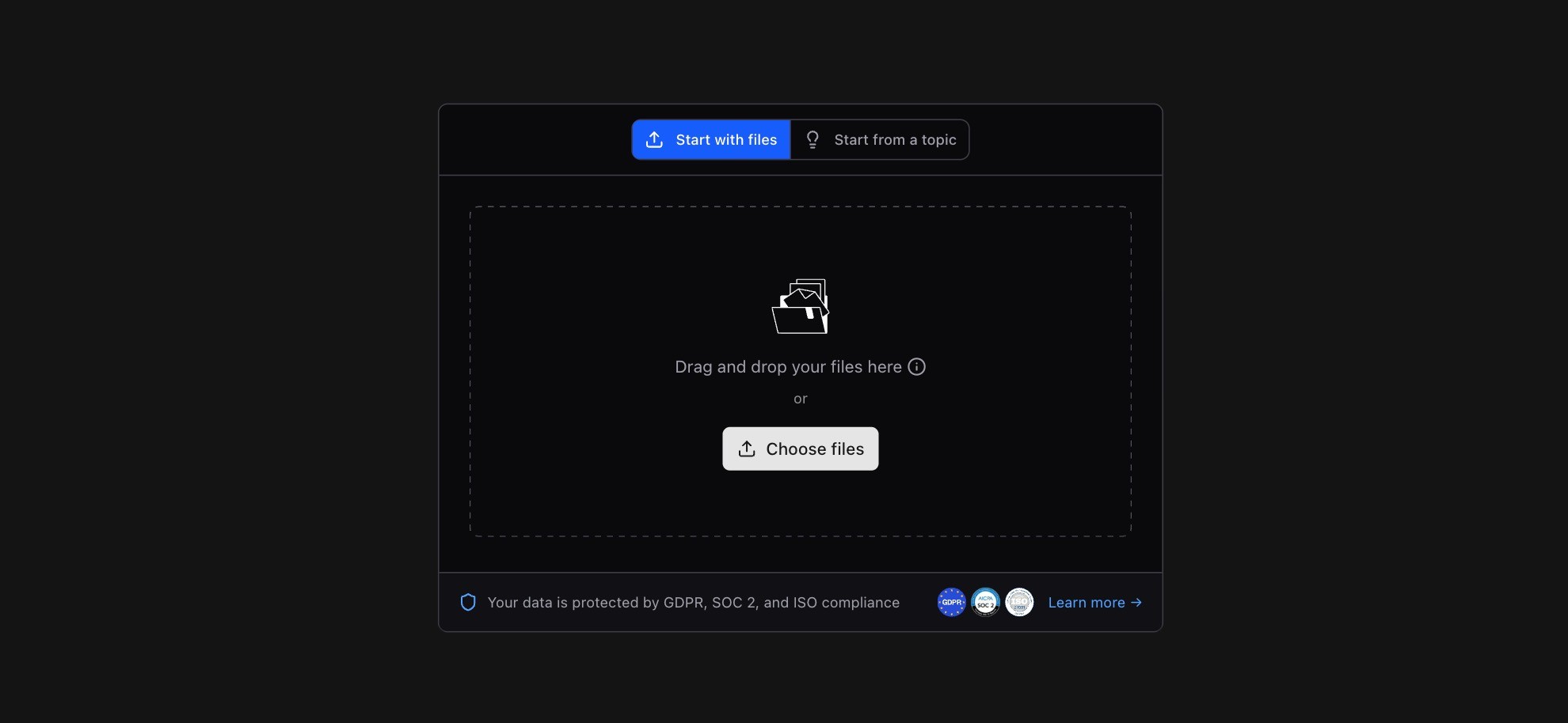
Sign in to Powerdrill Bloom, click "Start Blooming", and select the language you want Bloom respond in.

Upload your Excel into Bloom and then just let AI take the rest.
Here's the exploration result of Powerdrill Bloom.

In the first layer of exploration, Powerdrill Bloom reveals the following insights:
Cross-Market Performance
India shows a strong market edge ($16.4 advantage).
Quality comparison highlights India vs. Germany (4.31).
Security products dominate the India market with 62% share.
Product Category Positioning
Software products take 22.9% of the category share.
Average premium pricing: ₹3,610.
Software quality scores reach 4.3.
Rating–Revenue Link
Star ratings impact revenue by 14–25%.
Review volume strongly correlates with sales (31.1).
Top performers combine high ratings and high sales (37.5%).
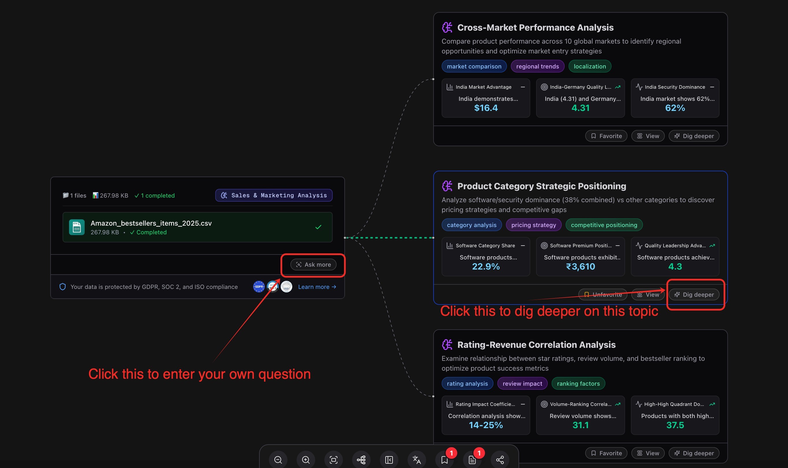
Step 2: Select the node you're interested to view the data visuals
For example, if you're interested in the second node, "Product Category Strategic Positioning," you can:
Click "View" on the node. In the details panel on the right, scroll down to the Data Analysis section.
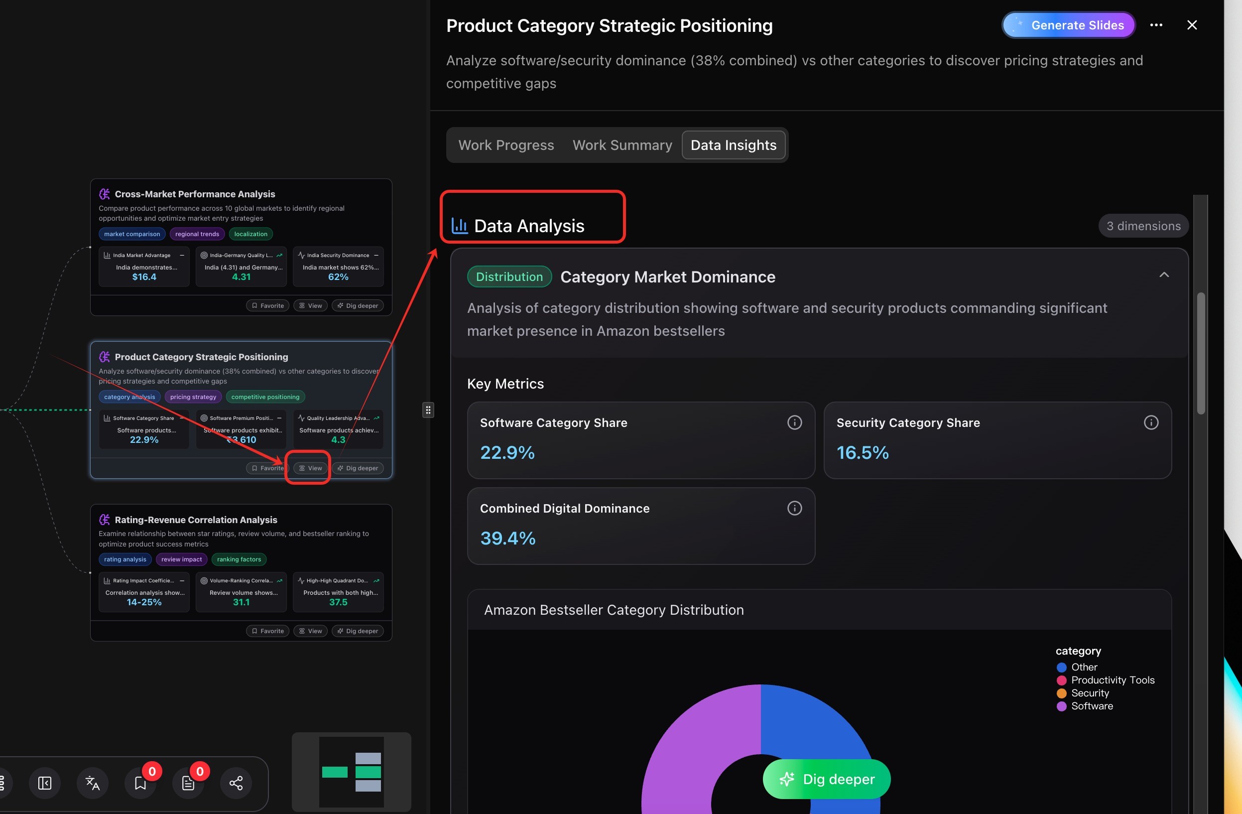
Explore the generated visualizations for that node.
Below is an example of the visualizations created for the "Product Category Strategic Positioning" node.

Step 3: Take the Visuals with You
Powerdrill Bloom makes it easy to share or reuse your analysis results. You can convert them into a PowerPoint deck, export directly to Notion, or download as an image.
Convert to PowerPoint (PPT)
Click "Generate Slides" in the upper-right corner of the node details panel.
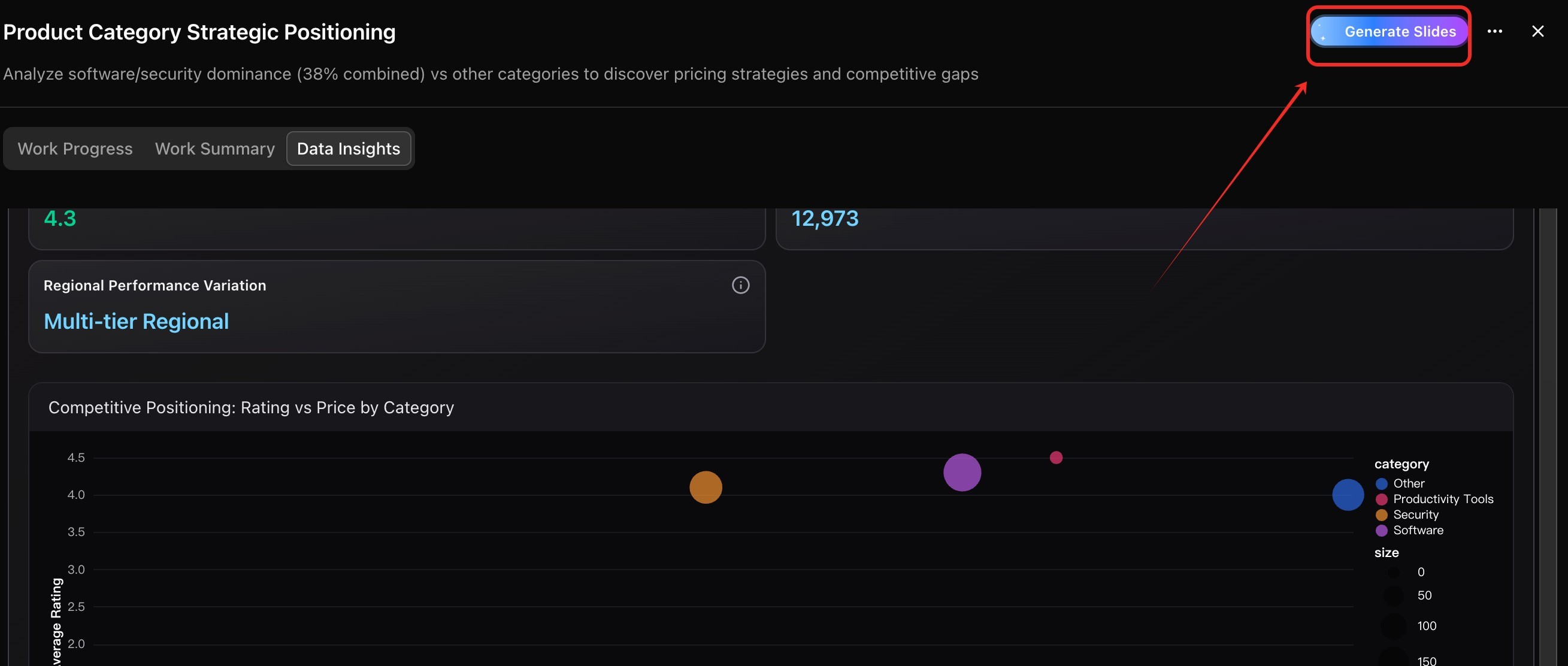
In the dialog box, click "Next."
Choose a theme and select "Start Generating Slides."
Once the slides are generated, download the PPT to view, edit, or share with your team.
Export to Notion
In the "Export to Notion" section, click "Export."
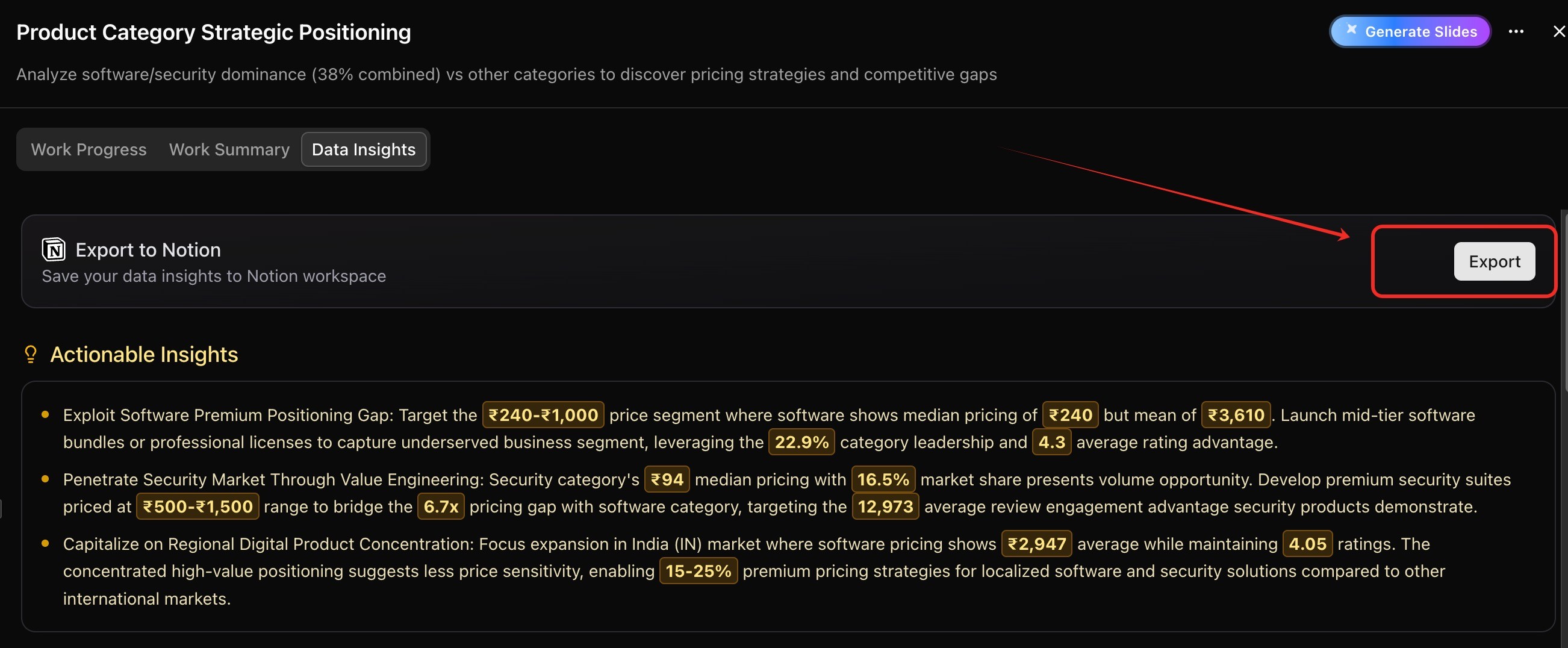
Follow the prompts to configure your settings.
Your analysis will then be available in Notion for easy viewing and collaboration.
Download as an Image
Click "…" > "Export as image."
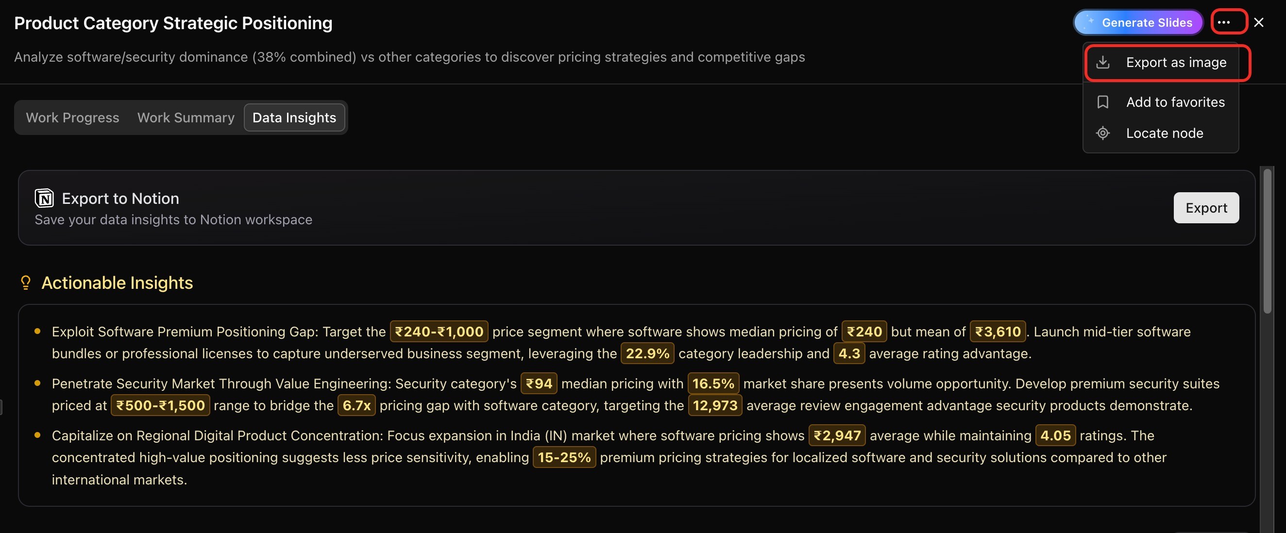
Deselect any details you don’t want included, then click "Export."
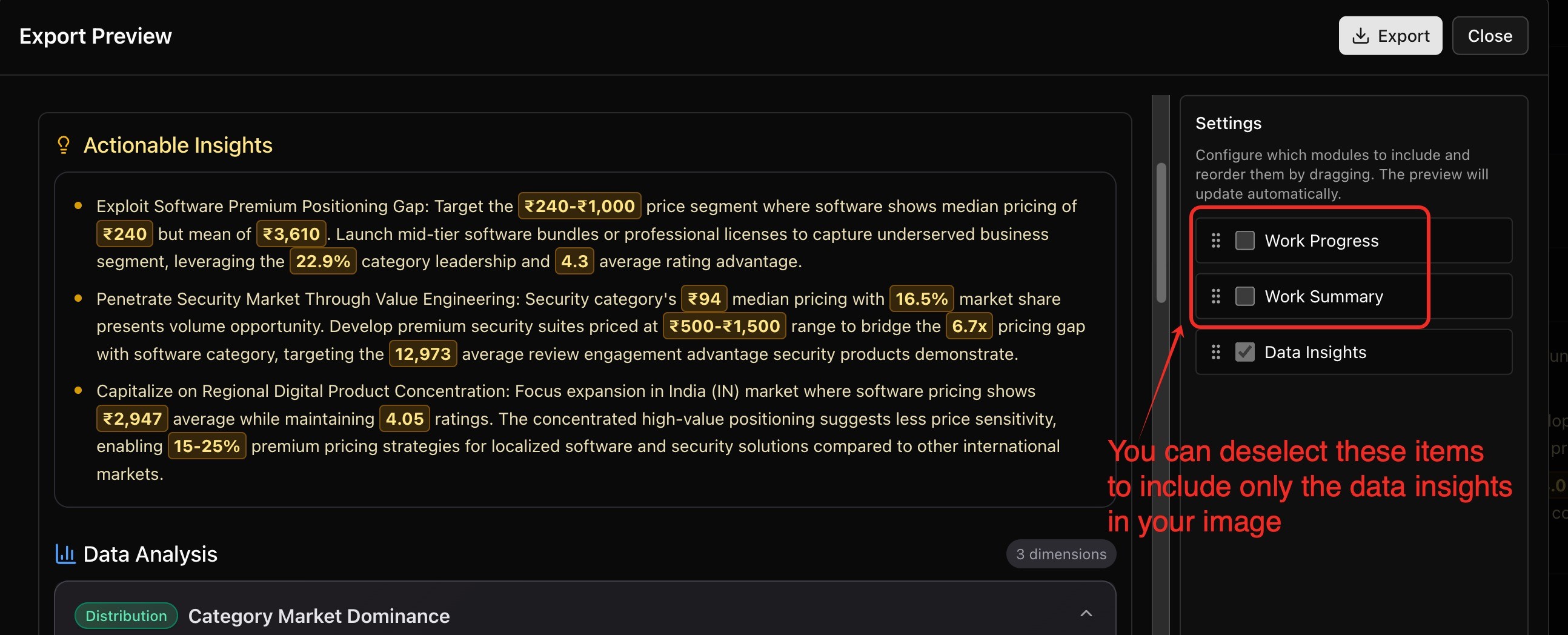
The selected visualizations will be saved as an image for quick sharing.
(Optional) Step 4: Explore deeper
If you’d like to continue exploring, you have two options:
Click "Dig deeper" to follow a specific analysis path.
Click "Ask more" to enter your own custom question.
Conclusion
Data visualization in Excel doesn't have to be slow or complicated. With AI-powered tools like Powerdrill Bloom, you can go beyond static charts and transform your spreadsheets into interactive dashboards filled with meaningful insights. Instead of spending hours formatting, you can focus on interpreting results, spotting trends, and making better decisions.
By combining the familiarity of Excel with the intelligence of Bloom, professionals at any skill level can quickly turn raw data into actionable stories. Whether you're preparing a business report, analyzing sales, or exploring new datasets, Bloom empowers you to visualize and understand your data faster, smarter, and with greater clarity.
Upload your Excel, ask a question, and watch Bloom do the rest. Try it today and see the difference.


