
Introduction
For decades, Microsoft Excel has been the go-to tool for working with data. From financial reports to sales forecasts, Excel empowers millions of professionals worldwide. Yet despite its ubiquity, Excel comes with barriers: formulas can be complex, pivot tables intimidating, and insights often buried in endless rows and columns.
This is where AI steps in. By combining Excel with artificial intelligence, anyone—regardless of technical background—can explore data, generate insights, and create visual reports in minutes. In this article, we'll walk through how Powerdrill Bloom, an AI-powered analytics tool, can transform the way you analyze Excel data.
Common Challenges in Excel Analysis
While Excel is powerful, users often run into a few recurring pain points:
Data overload: Large spreadsheets with thousands of rows are difficult to filter, navigate, and interpret.
Formula complexity: Functions like VLOOKUP, INDEX, MATCH, or nested IF statements require expertise and time to master.
Time-consuming reports: Generating charts, summaries, and dashboards often takes hours of manual effort.
Limited insights: Static tables don't always reveal trends, outliers, or correlations unless you know exactly where to look.
For many business users, this means insights stay locked away, delaying decisions and limiting productivity.
The Solution: Powerdrill Bloom
Powerdrill Bloom is designed to break down these barriers. It takes the raw data inside your Excel spreadsheets and turns it into a dynamic, AI-driven exploration experience.
Here's what makes it stand out:
AI-powered analysis: Upload your Excel file and let Bloom handle the heavy lifting.
Natural language interaction: Ask questions in plain English like “What’s the revenue trend this quarter?” instead of writing formulas.
Automated visualizations: Get instant bar charts, line graphs, or pie charts based on your queries.
Exploratory insights: Identify growth patterns, compare categories, and detect anomalies with zero manual setup.
AI-generated reports: Produce ready-to-share reports that summarize your findings in human-readable language.
In short, Bloom takes you from raw spreadsheets to actionable insights in just a few clicks.
Analyze Data in Your Excel: a Step-by-Step Guide
Step 1. Upload Your File and Let Bloom Analyze Your Data
To begin:
Sign in to Powerdrill Bloom.
Upload your Excel file.
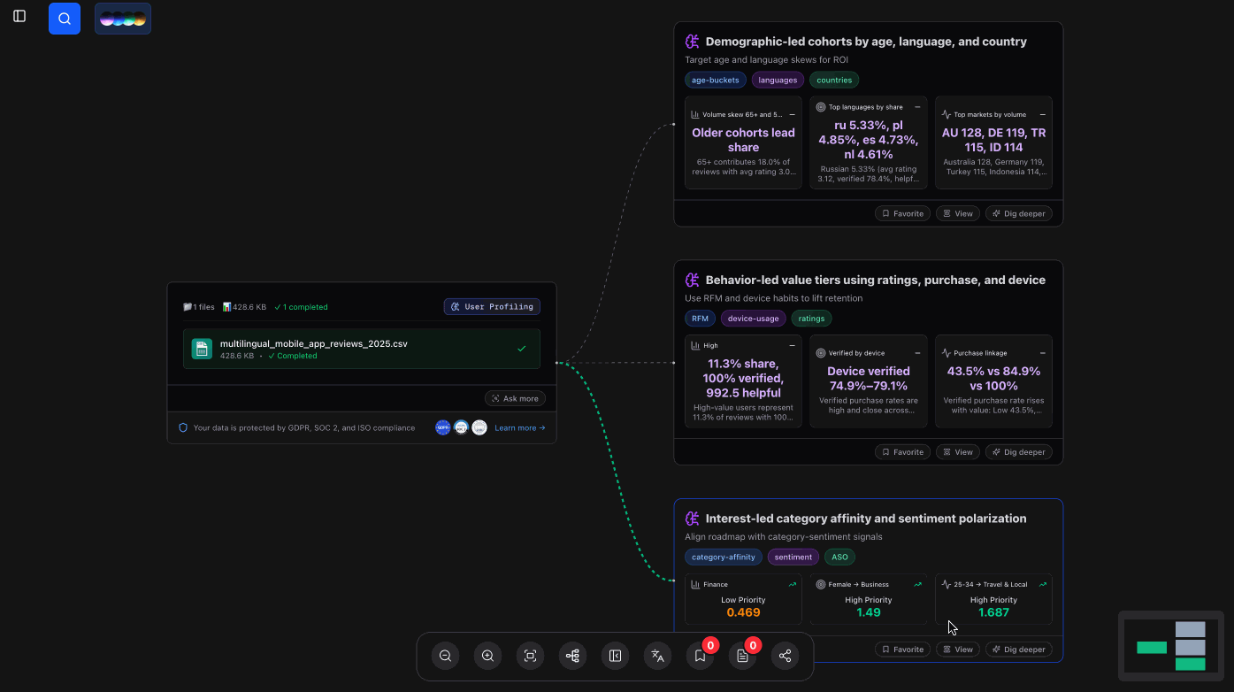
In this example, we used a comprehensive synthetic dataset named multilingual_mobile_app_reviews_2025.csv, which contains 2,514 authentic mobile app reviews from over 40 popular applications across 24 different languages.
Once uploaded, Bloom automatically scans and profiles the data—no manual setup required. It identifies key attributes such as demographics, behavior patterns, and sentiment signals, then organizes them into meaningful cohorts for further exploration.
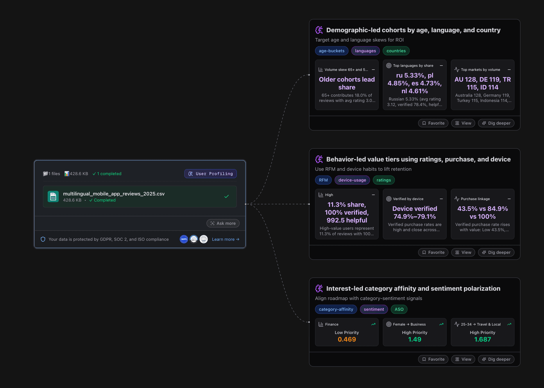
Immediately after the file is processed, Bloom highlights three primary perspectives from the reviews:
Demographic-led cohorts: Insights by age groups, languages, and countries. For instance, older user groups (65+) dominate review shares, while Russian and Polish users show significant language-driven trends.
Behavior-led value tiers: Segmentation by ratings, purchases, and device usage. Bloom flags high-value user segments, verifies device-based patterns, and links purchase behavior to retention.
Interest-led affinities and sentiment: Category preferences and sentiment polarization, helping you align product roadmaps with user expectations.
With just one upload, Bloom turns a multilingual, multi-market dataset into a structured, insight-rich foundation for further AI-driven analysis.
Step 2: Get the Insights and Stunning Visuals Away
Once Bloom has profiled your dataset, you can immediately dive deeper into the results. Each analysis card comes with a View button. By clicking it, you unlock a more detailed perspective that combines:
Actionable Insights: Clear, AI-generated explanations of what the data means—for example, which user cohorts drive the most reviews, or how purchase behavior links to retention. These insights are written in plain language, making them easy to understand and share across teams.
Stunning Visualizations: Automatically generated charts and graphs that bring the numbers to life. Instead of static tables, you get dynamic visuals—bar charts, line graphs, pie charts, or distribution plots—so patterns, trends, and outliers stand out at a glance.
With just a single click, Bloom transforms raw analytics into visually compelling stories. Whether you're analyzing demographics, behavioral tiers, or sentiment-driven category affinities, the visuals ensure your findings are both insightful and presentation-ready.
Step 3. (Optional) Convert the Analysis Results into a Presentation
After uncovering insights and visuals, Bloom makes it effortless to turn your analysis into a presentation-ready format. With just one action, you can export the results directly into slides—complete with charts, summaries, and AI-written narratives.
For details about how to generate a PPT, read the blog "How to Convert Excel to PPT".
Conclusion
Analyzing complex datasets no longer requires hours of manual effort in Excel or other traditional tools. With Powerdrill Bloom, you can simply upload your file, explore instant insights, and transform results into clear visuals and presentations in just a few clicks.
From multilingual app reviews to large-scale behavioral data, Bloom helps you uncover who your users are, how they behave, and what they care about most—all through AI-driven exploration. By turning raw data into actionable insights and presentation-ready reports, Bloom empowers teams to make faster, smarter, and more confident decisions.


