
What Is a Data Dashboard?

A data dashboard is a visual tool that displays key metrics and performance indicators (KPIs) in a clear, easy-to-understand format. Think of it like a car’s dashboard—just as a driver can check speed, fuel, and engine status at a glance, a data dashboard allows users to quickly assess the health of a business, process, or system.
These dashboards use charts, graphs, tables, and other visual elements to summarize complex data. For example, a sales team might use a dashboard that shows current revenue, month-over-month growth, and best-selling products—all in one view. This helps users monitor performance, analyze trends, and make informed decisions efficiently.
Common Types of Data Dashboards
Operational Dashboards
These dashboards provide real-time or near real-time insights into ongoing activities. In a manufacturing setting, for instance, an operational dashboard might show current production rates, machine uptime, and defect percentages. This enables managers to identify issues immediately and take corrective action.
Strategic Dashboards
Strategic dashboards are focused on long-term objectives and high-level performance. Executives often use them to track metrics like revenue growth, market share, and return on investment. These insights support strategic planning, such as market expansion or investment decisions.
Analytical Dashboards
Designed for data analysts and advanced users, analytical dashboards allow for deep data exploration. They often feature complex visualizations and filtering options. For example, a marketing analyst could use one to examine customer behavior, segment audiences, and identify emerging trends over time.
Steps to Build an Effective Data Dashboard
Building a successful data dashboard isn’t just about visuals—it requires planning, clarity, and alignment with business goals. Here’s a step-by-step guide to get it right:
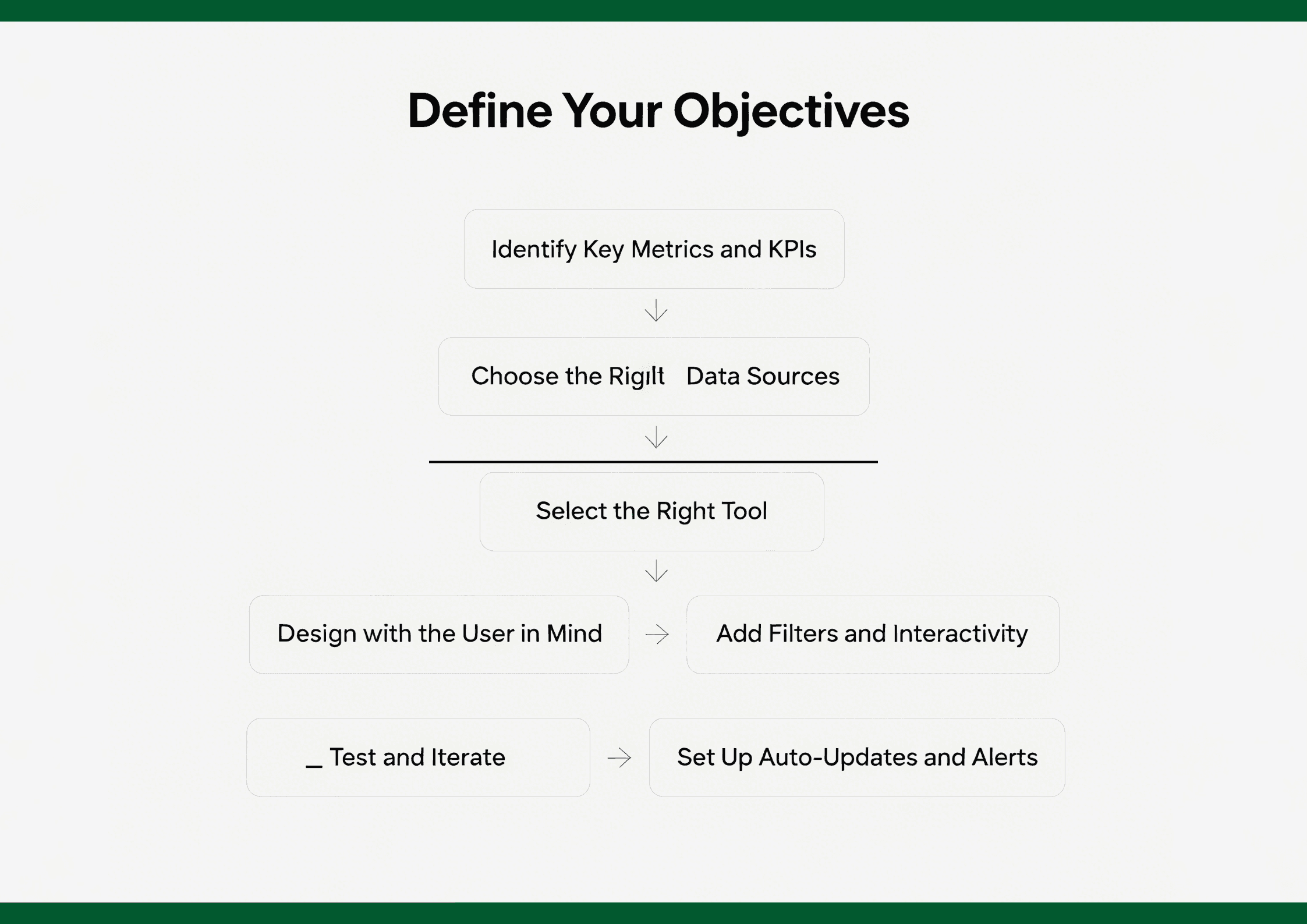
1.Define Your Objectives
Start by asking: What do you want to achieve with this dashboard? Whether it’s tracking sales, monitoring website performance, or improving operational efficiency, your goals will shape everything that follows.
2.Identify Key Metrics and KPIs
Select the metrics that matter most to your objective. Focus on actionable KPIs rather than vanity metrics. For example, instead of just total traffic, consider conversion rates or customer lifetime value.
3.Choose the Right Data Sources
Ensure your dashboard pulls from reliable and up-to-date data sources—this could include internal databases, CRM systems, spreadsheets, or cloud services. Data integrity is essential for trustworthy insights.
4.Select the Right Tool
Pick a dashboard platform that fits your needs. For quick deployment with AI support, tools like powerdrill or Tableau Pulse can be great. For more advanced analytics, consider Power BI or Sisense.
5.Design with the User in Mind
Layout matters. Use a clean, uncluttered interface. Group related metrics together, use consistent colors, and make sure charts are intuitive. Prioritize mobile responsiveness if your audience is on the go.
6.Add Filters and Interactivity
Allow users to drill down into data by adding filters, dropdowns, or clickable charts. Interactivity makes dashboards more engaging and insightful.
7.Test and Iterate
Before launching, test the dashboard with end users. Gather feedback on clarity, speed, and relevance. Make adjustments based on real-world usage patterns.
8.Set Up Auto-Updates and Alerts
Schedule data refreshes to keep information current. Consider adding automated alerts for key threshold changes, like a drop in sales or spike in support tickets.
By following these steps, you’ll build a dashboard that not only looks good—but actually helps teams make smarter, faster decisions.
Why Data Dashboards Matter
Better Decision-Making
Dashboards bring all critical data together in one place, making it easier to evaluate situations quickly. For example, a marketing manager can review campaign performance metrics—such as website traffic and customer acquisition costs—and make informed decisions about where to invest resources.
Continuous Performance Monitoring
With dashboards, teams can track individual and group performance in real time. A sales manager might use a dashboard to monitor the performance of sales reps, recognizing top performers and identifying those who may need additional support.
Enhanced Communication
Dashboards serve as a shared reference point across departments, ensuring everyone is aligned. For instance, both the finance and sales teams can refer to the same sales dashboard to get a unified view of business performance, leading to improved cross-functional collaboration.
Time Efficiency
Instead of combing through long reports, users can quickly grasp the essentials from a dashboard. This is especially valuable in fast-paced environments where quick decision-making is crucial.
Real-World Applications of Dashboards
Business Operations
In inventory management, dashboards help monitor stock levels, reorder points, and turnover rates, helping businesses reduce overstocking or avoid running out of products. In supply chains, they track delivery times, supplier performance, and shipping statuses.
Healthcare
Hospitals use dashboards to track metrics like patient wait times, bed occupancy, and treatment outcomes. This leads to more efficient operations and better patient care. For example, consistently high ER wait times can prompt immediate staffing or process changes.
Education
Schools and universities use dashboards to monitor student performance, attendance, and teacher effectiveness. Teachers can identify students falling behind and tailor interventions, supporting more personalized and effective learning experiences.
Best Practices for Building Effective Dashboards
Keep It Simple
Only include the most relevant KPIs and data points. Overloading a dashboard with too much information can overwhelm users and reduce clarity. Focus on the metrics that matter most.
Use the Right Visuals
Choose visualization types that suit your data. Use line charts to show trends, bar charts for comparisons, and pie charts for proportions. The wrong chart can lead to misinterpretation.
Ensure Data Accuracy
Accurate, up-to-date data is essential. Implement proper data governance and regular data refresh cycles. Decisions based on inaccurate data can be costly.
Make It Interactive
Interactive dashboards allow users to filter, drill down, and explore the data more deeply. For example, clicking on a data point in a chart could reveal more detailed information or trends over time.
A Brief History
The concept of dashboards dates back to the early computing era. In the 1960s and 1970s, mainframe computers produced basic text-based reports. With the emergence of graphical user interfaces (GUIs) in the 1980s, more visual data representations became possible.
By the 1990s, the rise of the internet and business intelligence (BI) tools made dashboards more accessible. Companies like Oracle and SAP began offering platforms with dashboard functionality. Today, thanks to the explosion of big data and tools like Tableau and Power BI, dashboards are integral to modern business decision-making.
How AI Simplified Dashboards
AI has supercharged dashboards by making them smarter, faster, and more intuitive:
Automated Data Connections & Cleaning
AI can connect to multiple data sources, clean and dedupe data, and keep dashboards updated automatically—saving hours of manual workFrom Reporting to Predicting
Modern dashboards aren’t just descriptive—they include predictive analytics to forecast trends and prescriptive insights that recommend actions. Some even offer interactive natural‑language querying, enabling users to ask, “What happened last quarter?” and get immediate answers.Guided Exploration & Insight Discovery
Intelligent dashboards can surface anomalies, trending insights, or correlations automatically. They guide users through exploratory steps—highlighting where to dig deeper—without needing data science expertise .Improved ROI Tracking
With embedded AI and automated reporting, businesses now measure outcomes like time saved, cost reduction, and data accuracy. In fact, 97 % of analysts now use AI to streamline reporting and document ROI.
In short, AI is transforming dashboards from static charts into interactive, proactive tools that help users see not just what’s happening, but what’s coming and what to do next.
Best Tools For Dashboards
Here are some of the leading tools transforming dashboarding with AI:
Powerdrill
Built for speed and simplicity, powerdrill is an AI-powered platform that lets you upload your data—Excel, CSV, SQL or PDF—and get immediate visualizations and insights. It uses natural language queries to generate charts, interpret trends, and even produce automated slides or reports.
Pros:
No-code interface—ideal for beginners
Real-time analytics and chart recommendations
Integrates with diverse data sources (databases, files)
Free tier available with scalable pricing tiers
Typical Use Cases: Ask “What are our sales trends?” and get instant visuals; auto-generate PowerPoint decks from raw data.
Tableau
A BI mainstay expanding into AI via Tableau Pulse, which integrates generative AI to surface insights, suggest next questions, and provide contextual explanations—all within the familiar Tableau UI.
Pros:
Powerful visual analytics with drag-and-drop interface
Tableau Pulse adds AI-powered alerts and automated insights
Rich community support and learning resources
Seamless integration with Salesforce ecosystem
Typical Use Cases:
Used by data teams and executives to monitor KPIs, build interactive dashboards, and receive real-time updates on business changes.
Microsoft Power BI
Power BI combines traditional BI dashboards with built-in AI to help users make smarter decisions. It includes AI features like Q&A (ask data in plain English), smart visual suggestions, and natural language generation for automatic summaries.
Pros:
Deep integration with Microsoft 365 and Azure
Built-in AI for trend analysis and natural language Q&A
Affordable pricing with enterprise capabilities
Strong governance and data modeling tools
Typical Use Cases:
Create enterprise-level dashboards for finance, sales, and operations; leverage AI to explain changes in business metrics automatically.
Sisense
Sisense delivers embedded, AI-powered analytics through its highly customizable platform. It enables developers and product teams to integrate analytics directly into apps using composable SDKs and APIs.
Pros:
Embeddable dashboards with full white-labeling
AI-driven features like forecasting and anomaly detection
Natural language querying and smart narratives
Scalable architecture for large datasets
Typical Use Cases:
Ideal for SaaS platforms needing in-app analytics; used to build tailored dashboards for end users with predictive capabilities.
Other Noteworthy Tools
Explo: Embedded dashboards with rich filtering and drill-down capabilities
Ajelix: Simplified AI analytics for non-technical users, ideal for marketers
Breadcrumb.ai: AI-first dashboarding for sales and event contexts
Final Thoughts
Data dashboards are more than just visual tools—they’re essential for efficient, informed, and strategic decision-making. Whether you're monitoring day-to-day operations or analyzing long-term performance, understanding how to use dashboards effectively can give you and your organization a powerful edge.


