
In today’s data-driven world, presenting complex information clearly and effectively is no longer a luxury—it's essential. Whether you're a data analyst, a startup founder, or a student working on a project, data visualization helps you uncover insights, tell compelling stories, and make informed decisions.
While there are many premium tools out there, you don’t need to break the bank to create impactful charts and dashboards. This article introduces 8 powerful, free data visualization tools that combine usability, functionality, and flexibility.
1. Powerdrill Bloom
Powerdrill Bloom is an AI-first data visualization and exploration tool designed to make it effortless for users to turn raw datasets into actionable insights. Unlike traditional BI tools that require manual setup, Bloom provides an AI Exploration Canvas, where users can upload spreadsheets (Excel, CSV, TSV, and more) and instantly receive graphs, summaries, and narratives—all without coding.
Its multi-agent AI system goes beyond visualization by automatically cleaning data, detecting anomalies, and suggesting new exploration paths. With one-click export to presentation-ready slides, Bloom makes it easier for individuals and teams to share insights and drive faster decisions.

Key Features
AI-powered data visualization with automated charts and summaries
Natural language queries for intuitive, conversational analysis
Multi-agent AI system for anomaly detection and guided exploration
Card-based workspace for organizing and sharing insights
One-click export to PowerPoint for client or team presentations
Support for multiple file formats, including Excel, CSV, TSV
Best for
Business users, marketers, and analysts who want to explore and visualize data quickly without needing technical skills. Perfect for teams that need fast, presentation-ready insights.
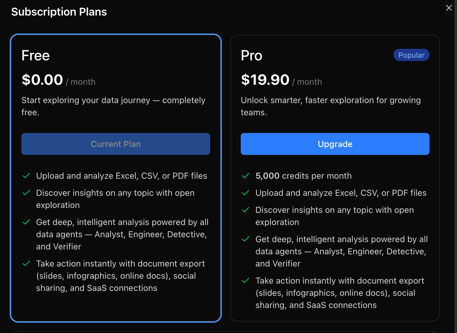
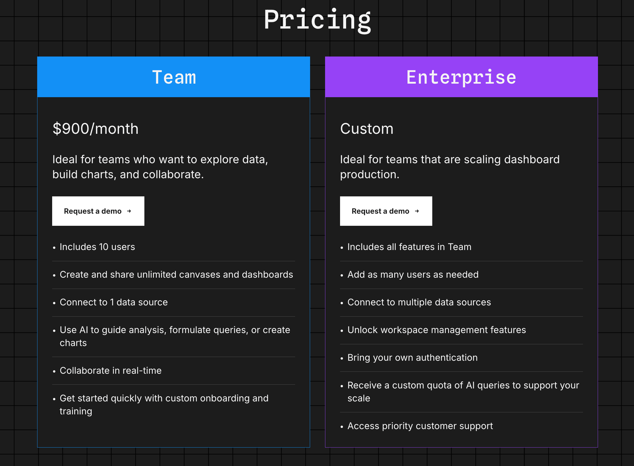
Pricing
Powerdrill Bloom offers simple, usage-based pricing with a Free plan to get started and a Pro plan for advanced AI exploration and higher productivity.
2. Power BI
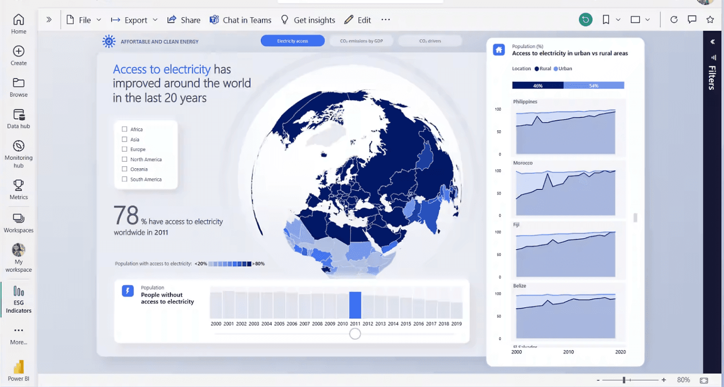
Power BI is Microsoft’s entry-level data visualization tool, offering a powerful suite of features for individuals looking to create dashboards and reports from structured data. It provides tight integration with Microsoft Excel, making it ideal for users already embedded in the Microsoft ecosystem. With a clean interface and powerful DAX language support, it allows users to transform raw data into compelling visual stories—even without prior BI experience.
Key Features
Integration with Excel, Azure, and SQL Server
Drag-and-drop dashboard builder
Large collection of built-in visuals
Power Query for data transformation
Native support for DAX formulas
Local desktop version available
Best for
Analysts, Excel users, and business professionals using Microsoft tools who want to create structured, professional reports without advanced training.
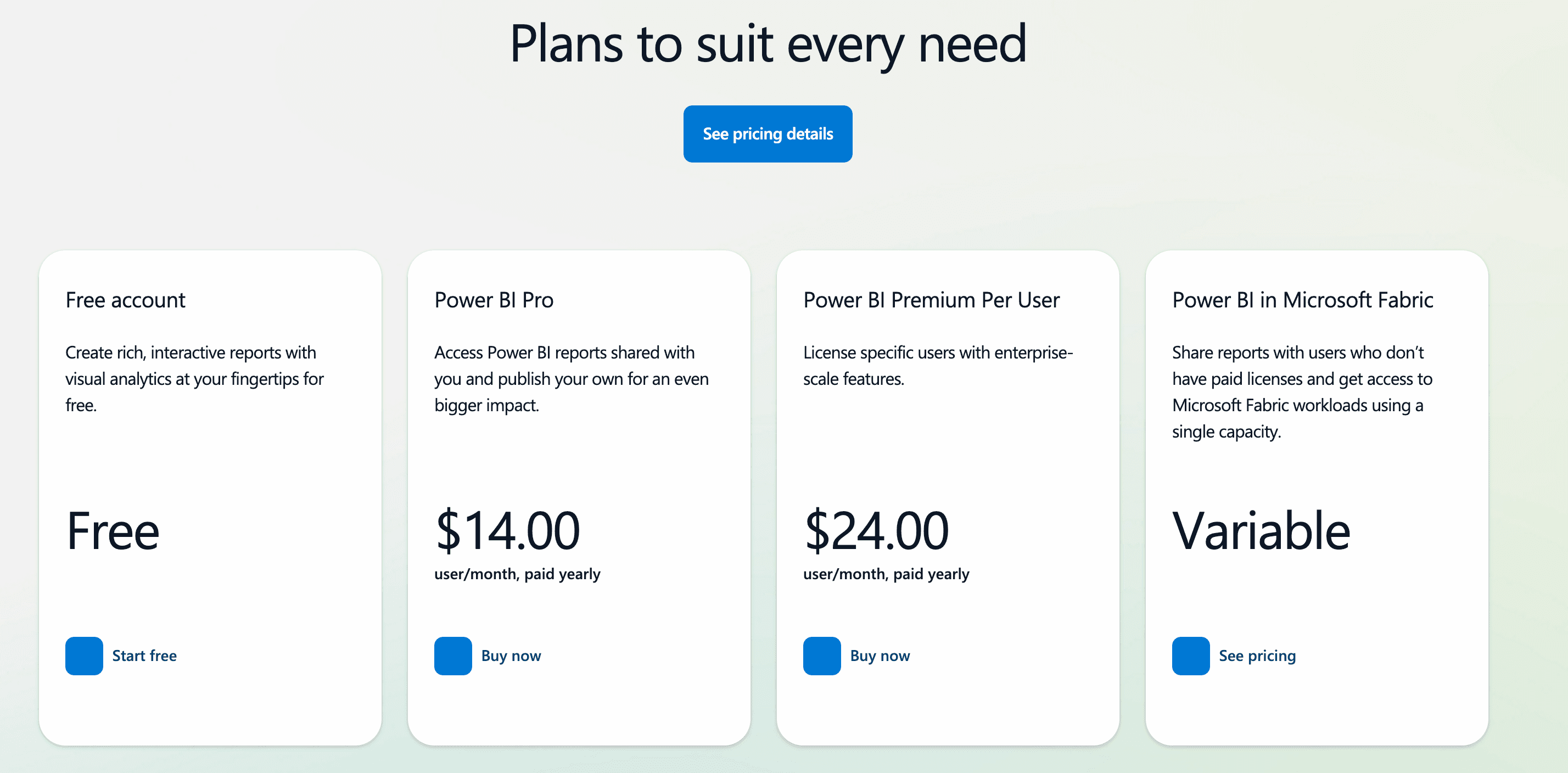
Pricing
Free for individual use. Sharing and collaboration features require Power BI Pro ($10/user/month). Enterprise-grade options are available with Power BI Premium.
3. Tableau Public
Tableau Public is a popular free platform for creating and sharing interactive data visualizations online. Designed with visual storytelling in mind, it helps users design stunning dashboards with minimal effort. While limited to public publishing, it offers nearly the same design power as Tableau’s paid products, making it a great starting point for anyone serious about data visualization.
Key Features
User-friendly drag-and-drop interface
Interactive dashboards and stories
Access to global gallery of public projects
Wide support for chart types and filters
Compatible with Mac and Windows
No coding required
Best for
Students, journalists, and data enthusiasts who want to showcase public projects or build a personal data portfolio.
Pricing
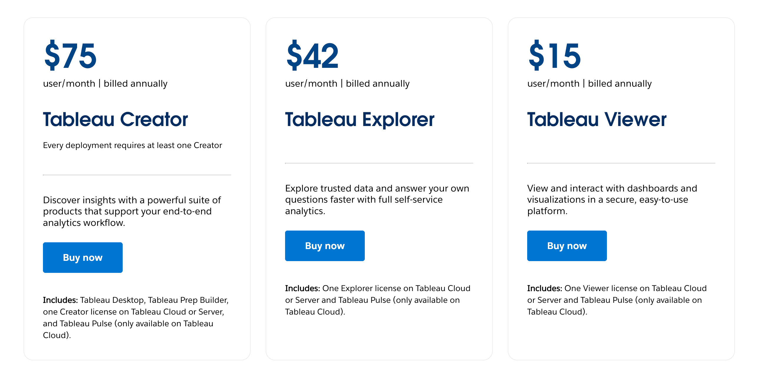
Free version publishes all content publicly. To keep dashboards private or use advanced analytics, upgrade to Tableau Creator ($75/user/month).
4. Google Looker Studio
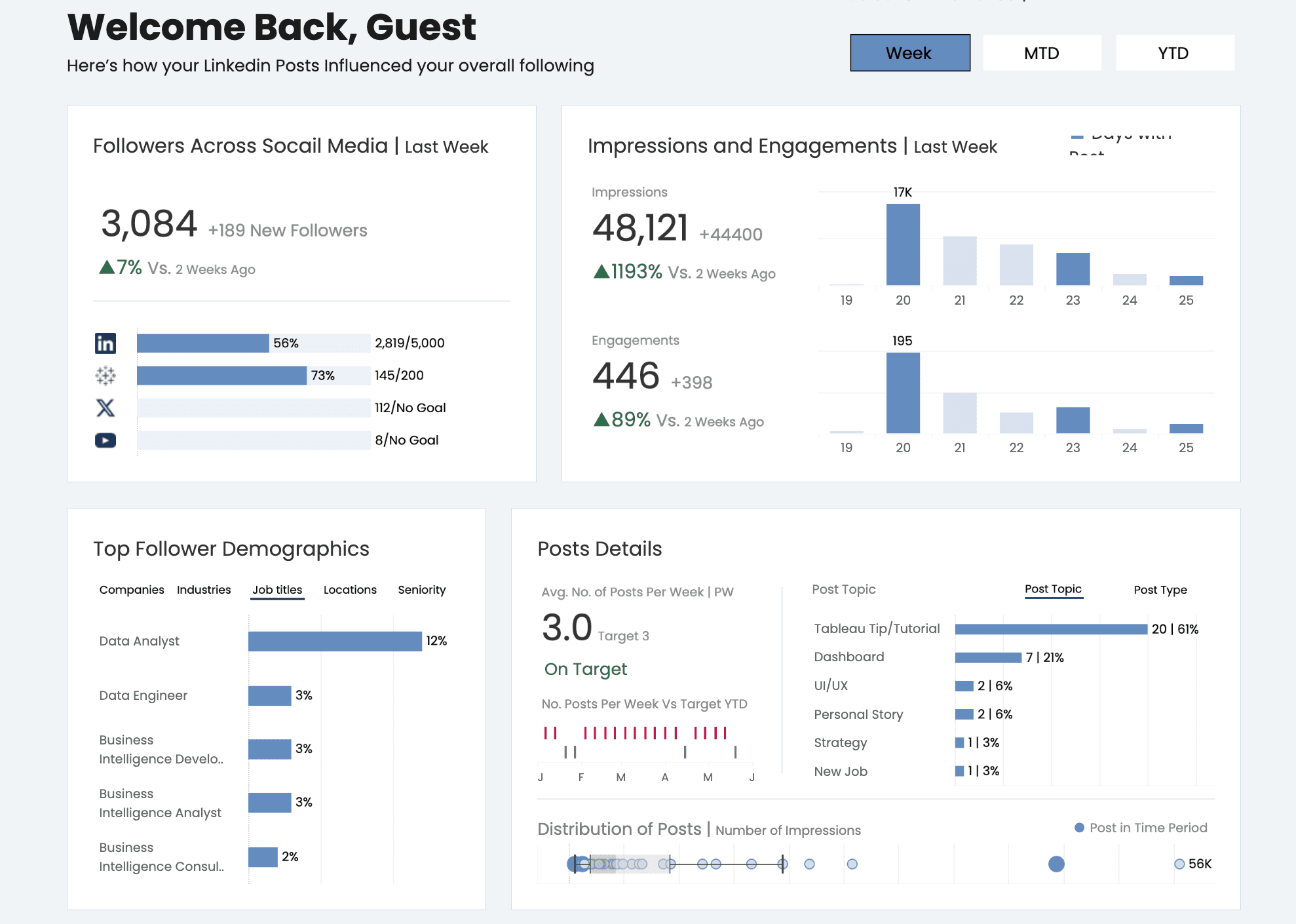
Formerly Google Data Studio, Looker Studio is a browser-based tool that lets users build dashboards by connecting directly to Google data sources like Sheets, Ads, and BigQuery. Its real-time updates, ease of use, and web-first design make it a go-to choice for marketers and business teams who need lightweight, collaborative reporting.
Key Features
Native integration with Google products
Real-time data refresh from live sources
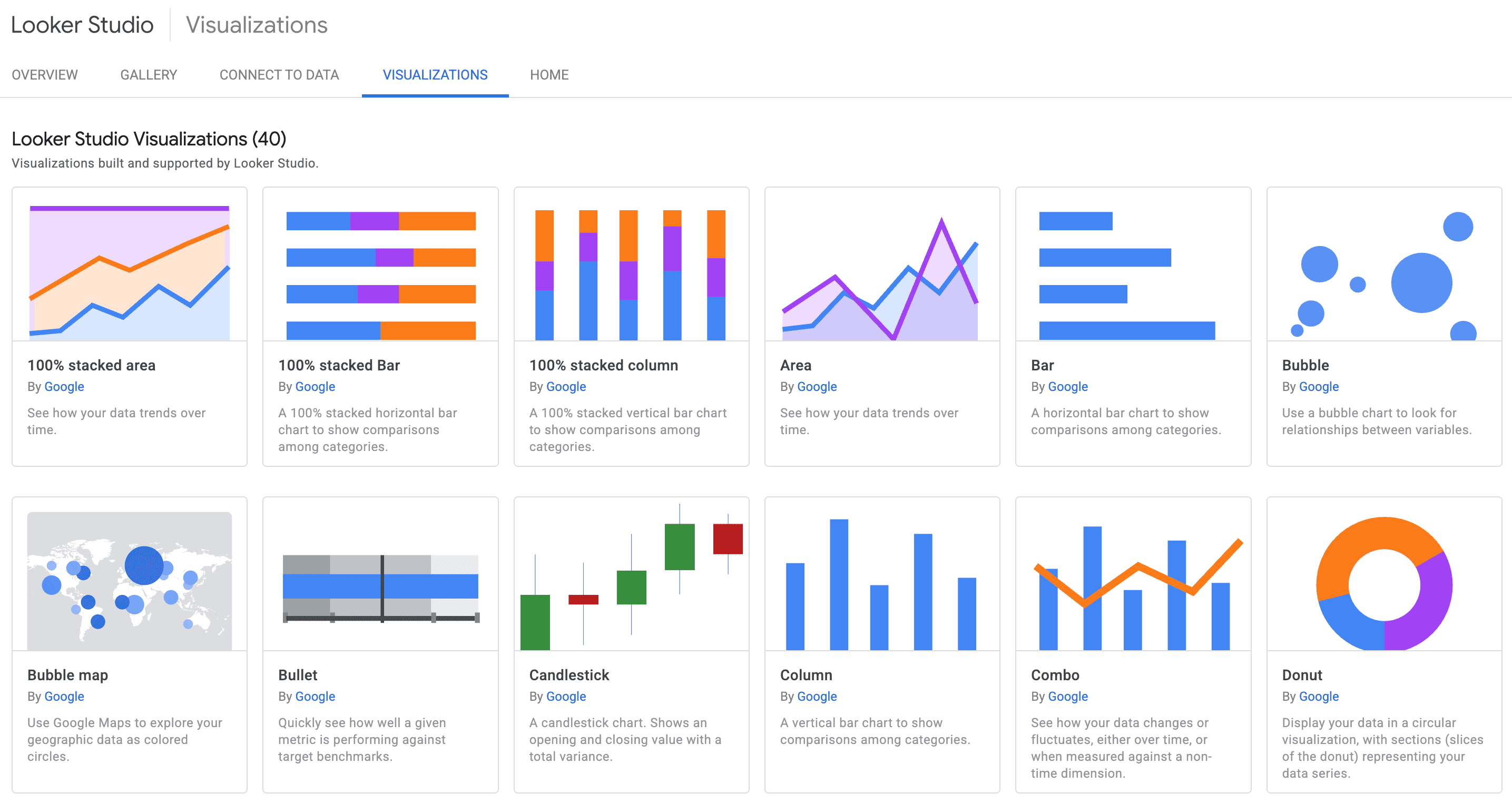
Built-in chart types and templates
Easy-to-share dashboards via links
Drag-and-drop interface for quick setup
Support for calculated fields and blending
Best for
Marketing teams, SEO specialists, and startups looking for fast, flexible dashboards with minimal setup and real-time collaboration.
Pricing
Fully free for all users. Some data connectors and advanced BI features require access to Looker (paid via Google Cloud).
5. Apache Superset
Apache Superset is an enterprise-ready, open-source business intelligence platform designed for users with SQL skills and data engineering needs. It excels at building scalable dashboards with fine-grained access control and works well in complex cloud or containerized environments. Superset is powerful and highly customizable, though it has a steeper learning curve than drag-and-drop tools.

Key Features
SQL-based report and dashboard creation
Support for dozens of SQL databases
Fine-grained access roles and permissions
Visual query builder and code editor
Filter and drill-down interactions
Easy Docker-based deployment
Best for
Data engineers, internal dev teams, and companies building internal BI systems that require performance, flexibility, and scale.
Pricing
Free and open-source under the Apache License. Users are responsible for hosting, maintenance, and scaling. Commercial support may be available via partners.
6. Metabase
Metabase is a user-friendly, open-source tool that allows teams to explore and visualize data without writing code. It supports SQL databases and provides a clean interface for building dashboards, answering questions, and delivering scheduled reports. It's ideal for organizations seeking a self-service analytics platform without committing to a large BI stack.
Key Features
Interactive dashboards and filters
No-code query builder
SQL editor with live previews
Embeddable visualizations for apps
Alerts and scheduled emails
Easy deployment (cloud, JAR, Docker)
Best for
Startups, product teams, and internal operations needing a quick and accessible way to explore and share data insights.
Pricing
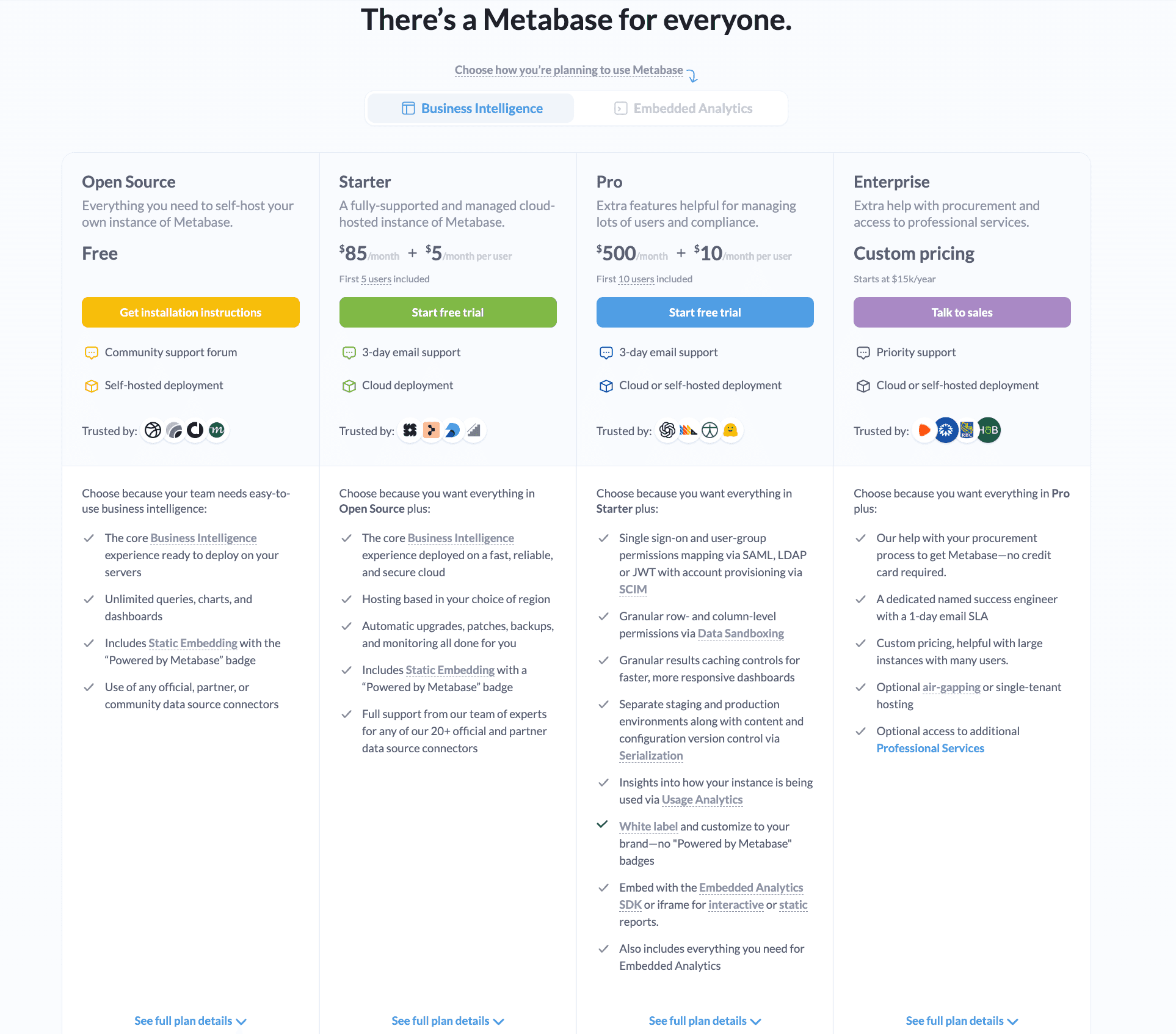
Free for open-source use. Cloud-hosted plans start at $85/month. Enterprise version includes SSO, audit logging, and scalable deployments.
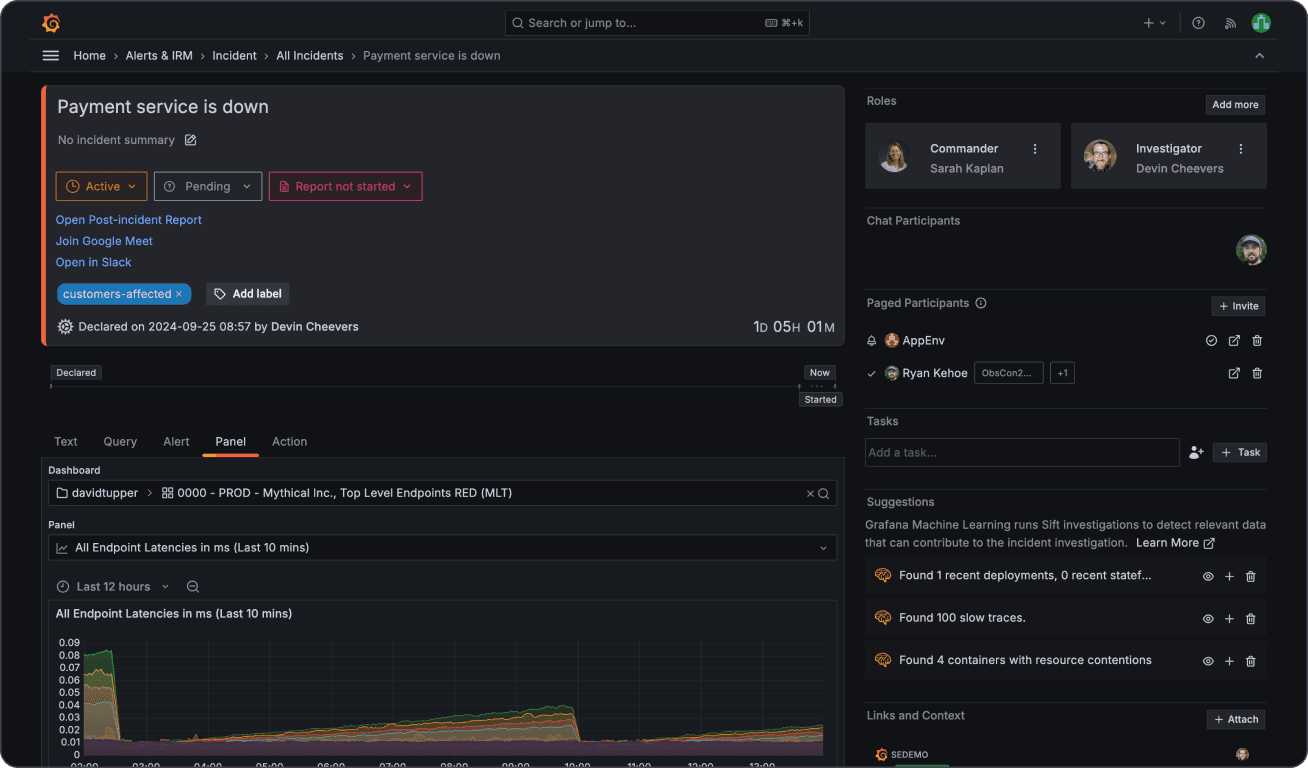
7. Grafana
Grafana is an open-source visualization platform widely used in DevOps and monitoring environments. It excels at real-time dashboards powered by time-series databases such as Prometheus and InfluxDB. With a rich plugin ecosystem and alerting capabilities, it’s perfect for technical teams needing continuous infrastructure insights.
Key Features
Real-time visualizations with live metrics
Built-in alerting and threshold detection
Wide support for time-series and log databases
Rich plugin marketplace
User roles and team dashboards
Dashboard embedding and theming
Best for
DevOps engineers, SREs, and system administrators looking to monitor infrastructure, server health, or application performance.
Pricing
Free and open-source. Grafana Cloud offers free and paid tiers, with pricing starting at $29/month for premium features like longer retention and alerting at scale.

8. Observable
Observable is a next-generation platform for building data visualizations using live, reactive JavaScript notebooks. It enables developers and designers to collaboratively create powerful, interactive graphics in the browser. With deep support for D3.js and functional reactivity, it stands out for advanced storytelling and prototyping.

Key Features
Reactive JavaScript notebook interface
Tight integration with D3.js and Vega-Lite
Live preview and collaborative editing
Community-driven notebook templates
Embedding in web projects or blogs
Version control and sharing tools
Best for
Developers, educators, and data journalists who want flexible, code-driven visualizations for storytelling or educational content.
Pricing
Free for public notebooks. Paid plans start at $12/month for private projects and team collaboration.
Conclusion
Whether you're a data analyst, developer, marketer, or founder, choosing the right data visualization tool can make a significant difference in how you understand and communicate your insights. From code-free dashboards to fully programmable apps, the tools covered in this list offer powerful capabilities—without the price tag.
The best part? You don't have to commit to just one. Many of these tools can complement each other depending on your workflow, data sources, and technical comfort level.
Ready to bring your data to life?
Explore one (or more) of the tools above, and start transforming your raw data into stories that drive action.


