
Analyzing data is no longer the sole domain of data teams. When organizations empower more stakeholders—from front-line workers to executives—to derive insights from data, business performance soars. In fact, 87% of respondents in a recent Harvard Business Review survey noted that equipping their teams with data-driven capabilities would significantly boost efficiency. But unlocking insights is just the beginning. The true magic happens when those insights evolve into a data story—a narrative that drives action, fosters alignment, and delivers tangible business impact.
In this guide, we’ll explore what is data storytelling, why it matters, data story telling examples and how you can master the art of weaving data into narratives that resonate.
What is a Data Story?
A data story is a narrative built around data, contextualizing insights to highlight broader implications for business goals. Unlike pure data analysis or business intelligence, which focuses on technical interpretation, a data story merges quantitative insights with qualitative context and domain expertise. It answers critical questions: What does this data mean? Why should stakeholders care? How does it tie to our objectives?
What is Data Storytelling?
Data storytelling is the craft of transforming raw data into a compelling narrative. It blends data analysis, visualization, contextual understanding, and effective communication to make complex information accessible. Whether you’re presenting to executives, cross-functional teams, or clients, the goal is to create a story that informs, engages, and inspires action.
Why Data Storytelling Matters
Data storytelling bridges the gap between insights and impact by:
Simplifying Complexity: It translates technical data into relatable contexts, ensuring audiences of all backgrounds—regardless of technical expertise—grasp key messages.
Engaging Diverse Learners: Visual learners thrive on charts and graphs, while auditory learners connect with spoken narratives. A strong data story balances these elements to keep everyone engaged.
Driving Action: By framing insights within business goals (e.g., improving customer retention, optimizing supply chains), stories motivate stakeholders to act on data, not just observe it.
Data Stories vs. Data Visualizations
While data visualizations (charts, graphs, dashboards) are essential tools in storytelling, they’re only part of the equation. A visualization might show a sales trend, but a data story explains why that trend matters—whether due to a marketing campaign, supply chain shifts, or consumer behavior changes. Storytelling adds context, purpose, and a narrative arc that turns static visuals into dynamic, actionable insights.
How to Tell a Data Story: 8 Essential Steps
Crafting a powerful data story requires a structured approach. Here’s how to build one that resonates:
1. Uncover the Story in Your Data
Start by asking: What does the data reveal? Look for patterns, correlations, or anomalies—like a sudden spike in customer churn or an unexpected surge in regional sales. These insights serve as the foundation of your narrative.
2. Know Your Audience
Tailor your story to your audience’s needs. Executives care about revenue impacts and strategic decisions; data teams prioritize methodology and statistical rigor. Align your technical depth and focus areas with their interests.
3. Prioritize Relevant Data
Modern businesses drown in data—focus on what matters. If your story is about customer satisfaction, prioritize feedback scores, purchase history, and support tickets over irrelevant datasets (e.g., employee engagement metrics). Clarity comes from focus.
4. Analyze to Extract Insights
Dive into your data to identify “so what?” moments. Tools like Powerdrill’s AI let you ask natural-language questions (e.g., “Why did Q3 sales dip in the Northeast?”) to surface instant insights and trends, ensuring your story is rooted in accuracy.
5. Choose the Right Visualizations
Visuals bring data to life—select formats that enhance your narrative:
Trends over time? Use line charts or area graphs.
Comparisons between groups? Bar charts or tables work best.
Geographic patterns? Maps or heatmaps clarify regional insights.
Powerdrill’s intuitive platform suggests optimal visualizations for your data and lets you build interactive dashboards, so stakeholders can explore insights in real time.
6. Add Context to Humanize Insights
Data alone is sterile. Weave in business reality: Did a new policy affect metrics? Did a global event create an anomaly? For example, a dip in website traffic might correlate with a server outage—context that explains the “why” behind the data.
7. Structure with a Narrative Arc
Follow a familiar story structure:
Introduction: Set the scene (e.g., “Our Q3 revenue target was $10M.”).
Conflict/Challenge: Highlight the problem (e.g., “But sales fell 15% in key markets.”).
Climax: Reveal the insight (e.g., “Data shows inventory delays caused fulfillment issues.”).
Resolution: Propose actions (e.g., “Streamline logistics to reduce delivery times.”).
This framework keeps audiences engaged and ensures your message sticks.
8. Edit Relentlessly for Clarity
Trim excess data and tangents. As Blaise Pascal once said, “I would have written a shorter letter, but I did not have the time.” Focus on your core message—every chart, statistic, and sentence should serve it.
Data Storytelling Examples
Tracking Supermarket Trends in America
The dataset we used here is from Kaggle, and the analytical tool we used is Powerdrill AI.
Sales Trend:
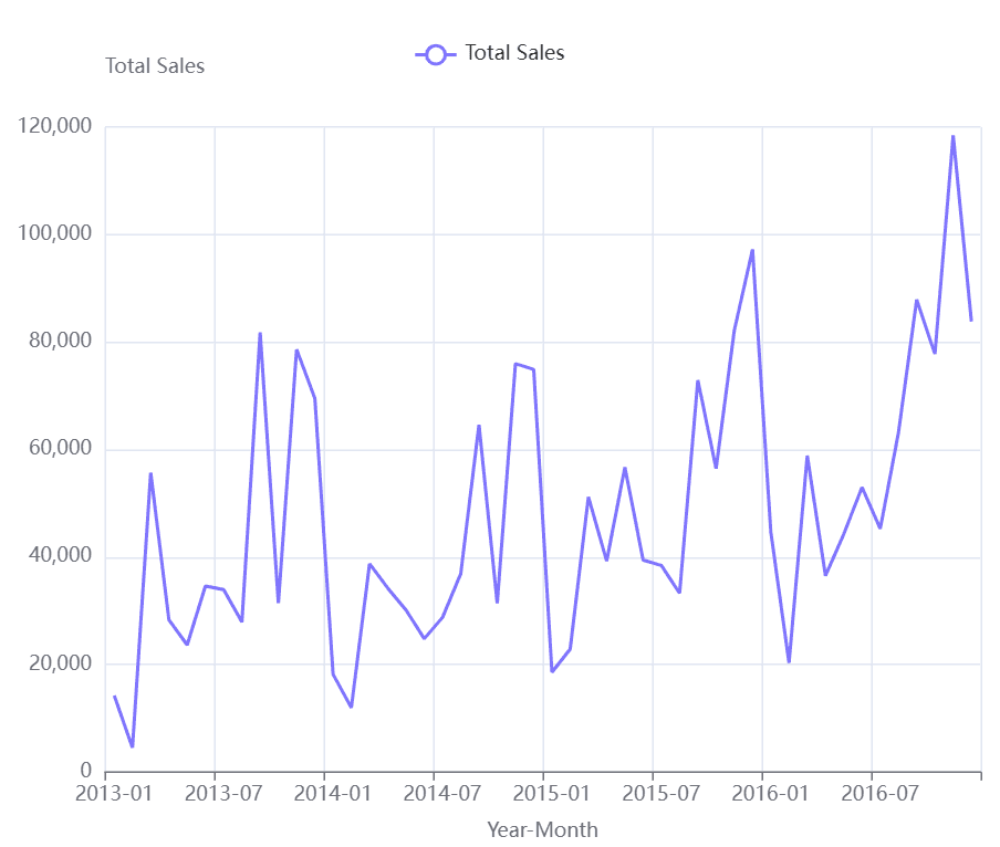
Sales fluctuate significantly throughout the year, with peaks typically occurring towards the end of the year . This line chart illustrates supermarket total sales from January 2013 to July 2016. Sales show significant fluctuations over time, with notable lows (e.g., near - zero in early 2013) and peaks (approaching 120,000), reflecting varied performance across months.
Regional Performance:
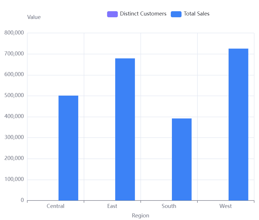
The West region leads in both customer count and total sales, while the South region lags behind. This chart shows supermarket total sales (blue bars) in four U.S. regions—Central, East, South, West. West has the highest sales (over 700,000), followed by East, Central, and South (lowest, ~400,000).
Profitability:
The Technology and Office Supplies categories are the most profitable, while Furniture has a significantly lower profit margin. This bar chart shows supermarket profit margins by product category. Furniture has a low profit margin (near 0.02), while Office Supplies and Technology both have significantly higher profit margins (around 0.17 each), indicating these categories are more profitable.

5 Tips for an Effective Data Story
1. Visuals Are Non-Negotiable
Use clear, high-impact charts and graphs—they’re the backbone of your story. Powerdrill’s drag-and-drop interface makes it easy to create professional visuals without technical expertise.
2. Relevance Over Riches
Resist the urge to include every dataset. Prioritize what advances your narrative—irrelevant details dilute your message.
3. Timeliness Matters
Trends evolve quickly. Use real-time data and tools like Powerdrill’s automated alerts to ensure your story reflects the latest insights, not outdated findings.
4. Ethics First
Avoid cherry-picking data or forcing misleading correlations. Transparency builds trust—your story should reflect the data honestly, even when insights are uncomfortable.
5. Clarity Above All
Speak plainly. Avoid jargon, define technical terms, and guide your audience through the narrative logically. A clear story is a memorable story.
What Story Do You Want to Tell?
Data storytelling is a superpower for modern businesses. It turns numbers into narratives, insights into action, and complexity into clarity. With AI-driven tools , you can analyze, visualize, and present data seamlessly—all in one platform.
Ready to craft data stories that drive results? Start your free trial of Powerdrill today and transform how your organization sees, understands, and acts on data.
Join the conversation: How has data storytelling impacted your business? Share your thoughts in the comments!


