
Introduction – The Challenge of Manual Data Visualization
Turning raw data into meaningful visuals has always been a time-consuming process. Analysts, marketers, and researchers often spend hours cleaning spreadsheets, choosing the right chart type, and adjusting colors or labels just to make data understandable. For many, this process requires specialized tools or even coding knowledge — creating a barrier between people and the insights hidden in their data.
Powerdrill Bloom changes that entirely. It transforms how you visualize and understand data by letting you create clear, professional-looking graphs in seconds — without writing a single line of code. Whether you’re analyzing business performance, presenting research findings, or simply exploring trends in a dataset, Powerdrill Bloom empowers you to focus on insights, not technical steps.
Imagine uploading your dataset and instantly seeing interactive bar charts, line graphs, and scatter plots automatically generated for you. With Powerdrill Bloom, that’s exactly what happens — making it effortless for anyone to turn data into stories that inspire action.
Why Fast Data Visualization Matters
In a world where data is generated faster than ever, speed is no longer a luxury — it's a necessity. Teams that can quickly visualize and interpret their data make smarter, faster decisions that drive real results. Yet most tools still slow this process down, forcing users to switch between spreadsheets, chart builders, and dashboards before uncovering a single insight.
Powerdrill Bloom eliminates that friction. By instantly turning your dataset into ready-to-explore visualizations, it allows you to move from raw numbers to clear understanding in seconds.
For business analysts, that means identifying performance drops or growth trends before they escalate.
For marketers, it means transforming campaign data into visuals that reveal what truly drives engagement.
For educators and researchers, it means presenting findings visually — without needing coding or design expertise.
When every second counts, the ability to visualize data instantly doesn’t just save time — it accelerates decision-making, collaboration, and innovation across your entire workflow.
Common Pain Points in Traditional Chart Creation
Despite the abundance of analytics tools available, creating a simple, effective graph is often harder than it looks. Most users still face several common frustrations when trying to visualize their data manually:
Complex setup and configuration: Traditional BI tools or spreadsheet software often require dozens of clicks — from importing data to selecting fields, setting chart parameters, and styling every detail.
Coding or technical skills needed: Many advanced visualization platforms demand SQL, Python, or scripting knowledge, excluding non-technical users from data exploration.
Choosing the right chart type: Even experienced users spend time testing different charts before finding one that clearly communicates their data story.
Static and disconnected visuals: Once generated, charts often lack interactivity or real-time updates, forcing users to rebuild visuals when data changes.
Inconsistent design and formatting: Small errors in labels, scales, or colors can easily distort insights or make charts harder to interpret.
These obstacles don’t just waste time — they slow down discovery. Every hour spent formatting or troubleshooting a graph is an hour lost to actual analysis.
Powerdrill Bloom removes these barriers by automating every technical step. Instead of manually building each chart, you simply upload your dataset, and Bloom does the rest — intelligently analyzing your data, selecting the best visualization types, and generating polished, ready-to-share results in seconds.
Introducing Powerdrill Bloom: Graphs in Seconds
Powerdrill Bloom redefines how people interact with data. It’s not just another visualization tool — it’s an intelligent system that understands your dataset and transforms it into clear, insightful visuals instantly. No setup. No manual chart selection. No wasted time.
With Bloom, data visualization becomes as simple as three steps:
Upload. Generate. Explore.
Once you upload your dataset — whether it’s from Excel, CSV, or PDF — Bloom’s AI engine automatically detects the data structure, identifies relationships, and generates the most relevant graphs in real time. You’ll instantly see line charts showing trends, bar graphs highlighting comparisons, and scatter plots revealing correlations — all without lifting a finger.
Bloom isn’t limited to one chart per dataset either. It gives you multiple perspectives at once, helping you explore your data from different angles to uncover patterns you might otherwise miss. Each visualization is interactive, customizable, and ready to be shared or embedded in reports.
In short, Powerdrill Bloom turns the slow, manual charting process into a seamless, intelligent experience — giving you the power to visualize insights in seconds and focus on what truly matters: understanding your data.
How Powerdrill Bloom Works (Step-by-Step)
Getting started with Powerdrill Bloom takes only a few seconds — no tutorials, no setup, no coding. Here’s how it works from start to finish:
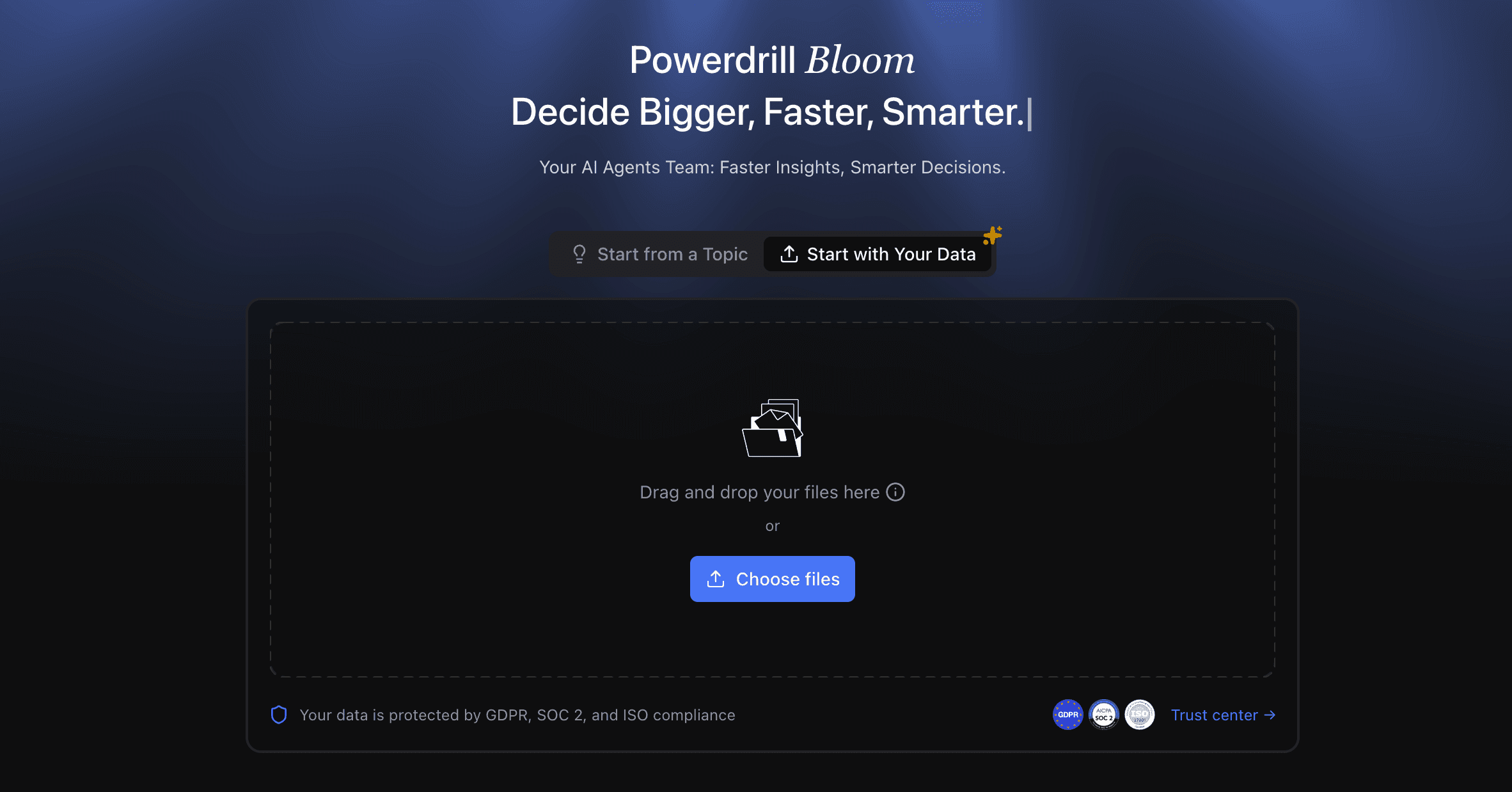
Step 1. Upload Your File
After signing in to Powerdrill Bloom, upload your file, confirm the directions you want to explore, and then wait for the completion of data exploration automatically performed by Powerdrill Bloom.
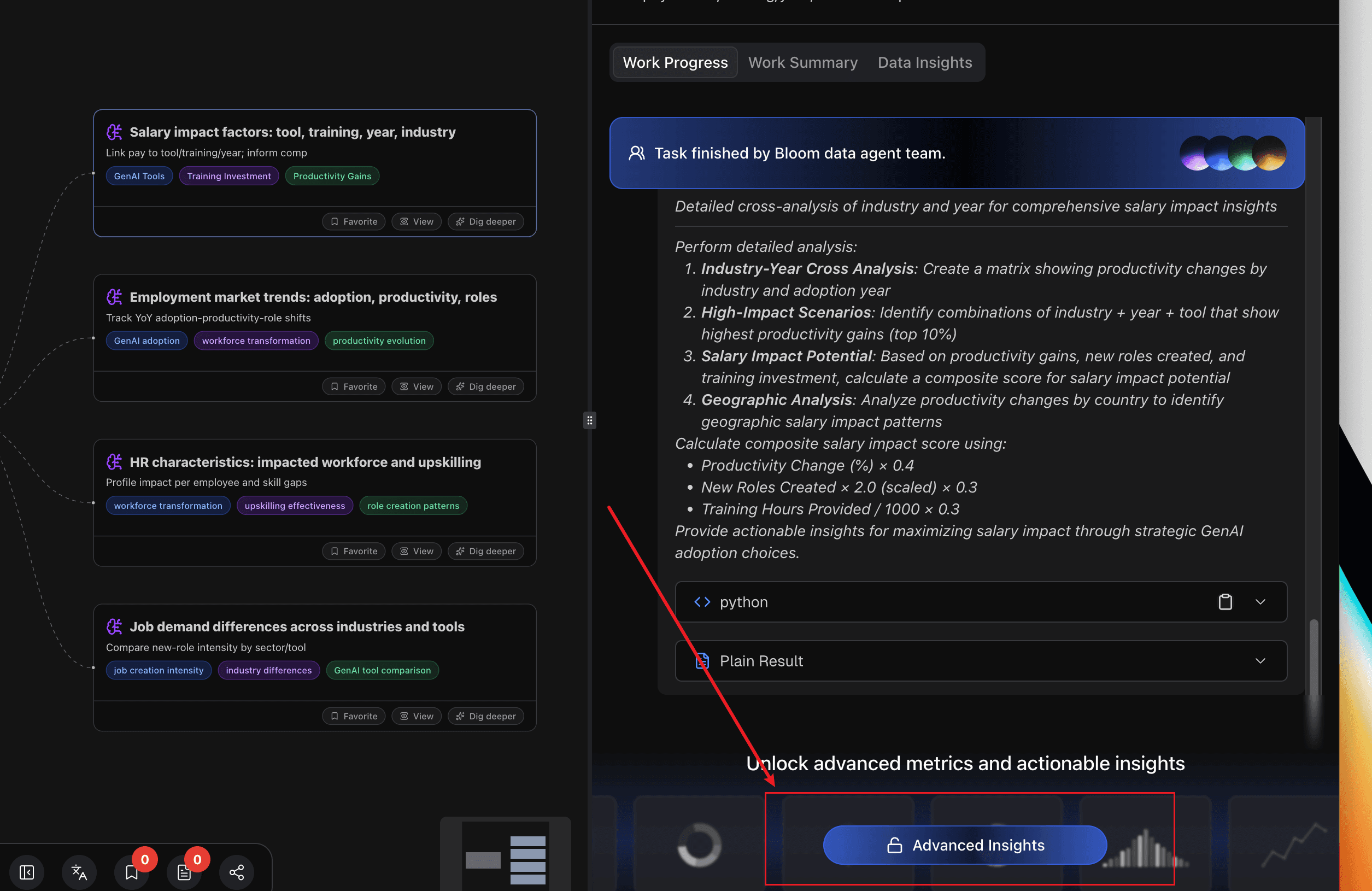
Step 2. Unlock Advanced Insights and View Details
In this article, we use GenAI adoption as an example. You can click the following link to view the original exploration report.
In each node that you're interested in, click "View" to enter the details page.
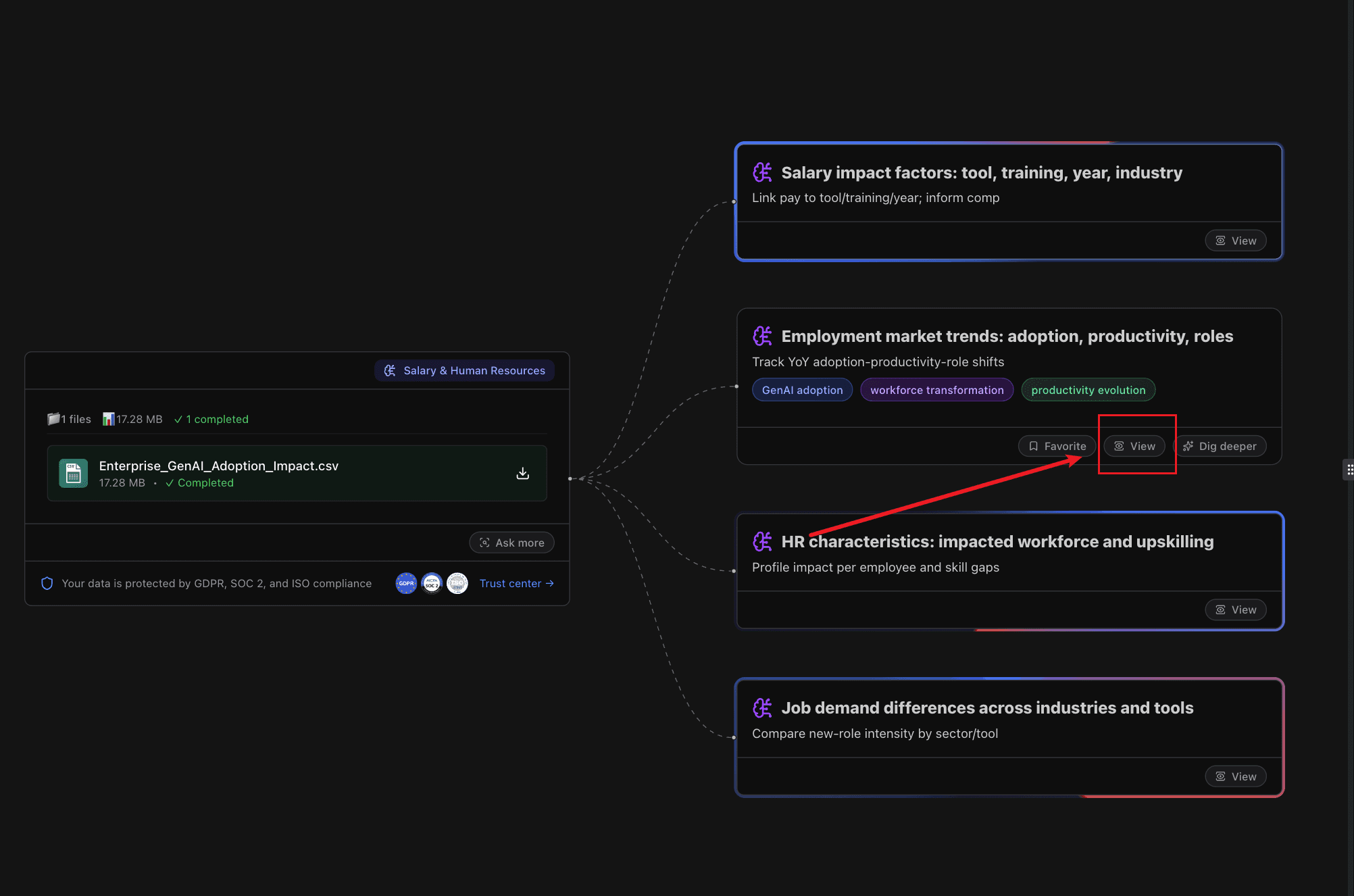
Then click "Advanced Insights".
Repeat steps 1 and 2 on each node that you're interested in.
If you want to explore further in any direction, click "Dig deeper" on the corresponding node.
You can check the graphs generated.
Example 1:
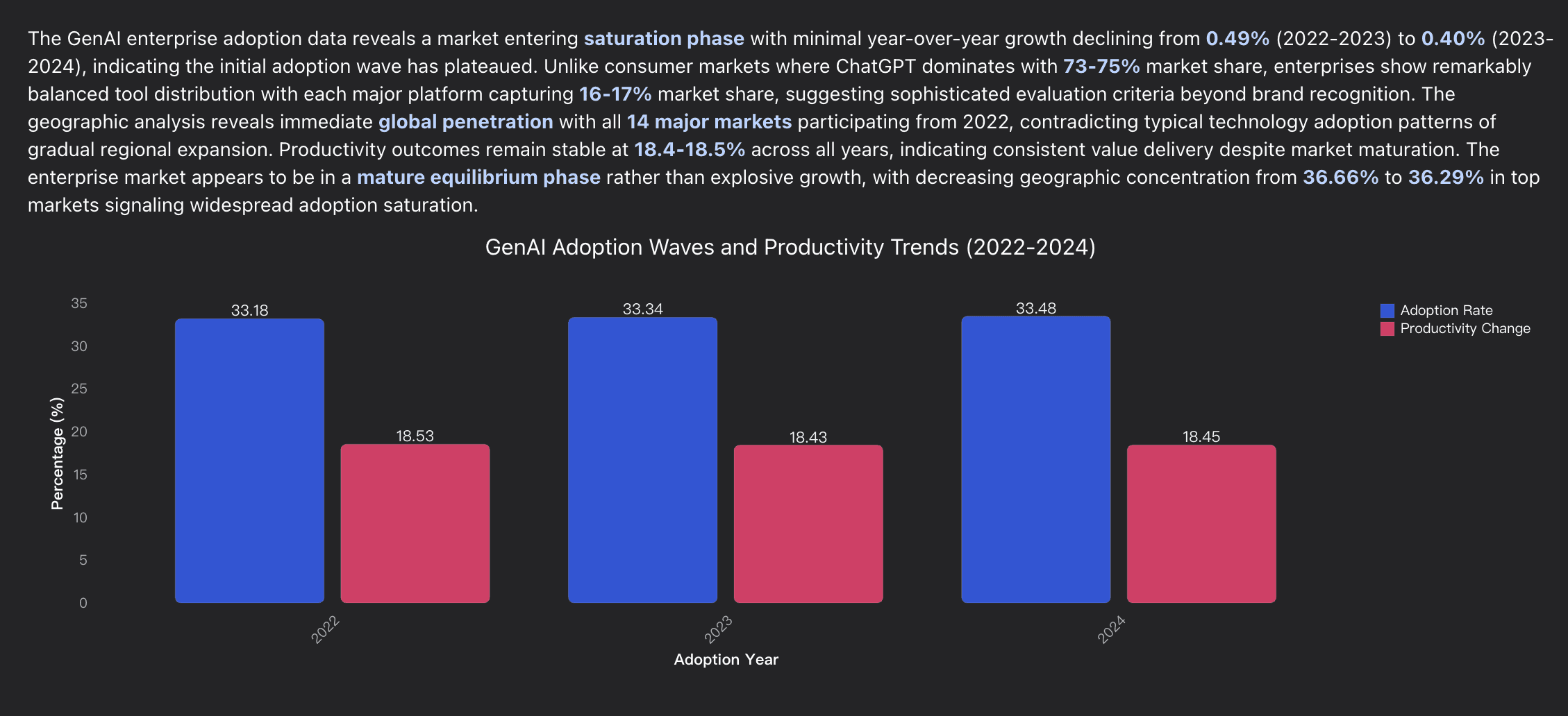
Example 2:
Step 3. Take the Charts and Graphs Away
If you want to take them away, you can convert the results into infographics, PPT, Notion pages, and more in the "Actions" section.
For details about how to convert it to an infographic, read the post "Creating an Infographic Based on a Topic with AI: a Step-by-Step Guide".
For details about how to convert it to PPT, read the post "How to Convert PDF to PPT with Insights and Analysis | Powerdrill Bloom Use Case".
For details about how to convert it to a Notion page, read the post "Import Data Insights and Charts to Notion in One Click | Powerdrill Bloom Use Case".
Smart Visualization Types
Powerdrill Bloom doesn’t just draw charts — it understands which charts best express your data. Its AI engine automatically recommends visualization types that highlight patterns, trends, and relationships in the clearest way possible.
Here are some of the most common chart types Bloom generates — and when to use them:
Chart Type | Best For | Example Use Case |
|---|---|---|
Bar Chart | Comparing categories or groups | Compare product sales across regions |
Line Chart | Showing trends over time | Visualize monthly revenue or website traffic growth |
Pie Chart | Showing proportions or composition | Display market share by brand or department budget allocation |
Scatter Plot | Exploring correlations between variables | Analyze how advertising spend relates to sales performance |
Heatmap | Highlighting density or intensity patterns | Discover user activity by hour and weekday |
Area Chart | Showing cumulative progress or overlapping trends | Track total revenue and costs across quarters |
Each chart is generated intelligently based on your dataset’s structure — numerical columns, date ranges, and categorical variables are automatically recognized and matched with the right visual form.
Bloom also allows you to switch between chart types instantly, so you can experiment with different visual perspectives until your insight becomes crystal clear. Whether you’re comparing categories, revealing time-based patterns, or uncovering correlations, Powerdrill Bloom ensures your visuals always tell the right story — effortlessly and beautifully.
Conclusion
Data visualization shouldn’t be slow, technical, or intimidating. With Powerdrill Bloom, anyone — from business analysts to students and researchers — can turn complex datasets into meaningful insights in just seconds.
By combining intelligent automation with an elegant, no-code interface, Bloom removes the friction between data and understanding. You no longer have to spend hours formatting spreadsheets or guessing which chart to use. Instead, Bloom gives you instant clarity — letting you explore, customize, and share insights that drive smarter decisions.
Whether you’re analyzing performance metrics, visualizing survey results, or preparing reports, Powerdrill Bloom helps you move faster from data to story.
It’s not just about making charts — it’s about empowering everyone to see their data differently.
Try Powerdrill Bloom today and experience the fastest way to visualize your data.
FAQ
1. What types of files can I upload to Powerdrill Bloom?
Powerdrill Bloom supports CSV, Excel (XLSX), and PDF formats. You can upload datasets of various sizes — from small samples to large business reports.
If you have no specific files at hand. That's also okay. You can just enter a topic and let Powerdrill Bloom explore.
2. Do I need any technical or coding skills to use Powerdrill Bloom?
Not at all. Powerdrill Bloom is built for everyone, even those with no technical background. You simply upload your dataset, and Powerdrill Bloom automatically creates the most suitable graphs.
Can I customize the charts after they’re generated?
No. Currently, the generated charts are not customizable.
Is my uploaded data safe and private?
Absolutely. Your datasets remain secure and confidential. Powerdrill Bloom processes files in a controlled environment and never shares your data with third parties.
5. What if I'm unsure which chart best fits my data?
Powerdrill Bloom automatically recommends and generates the most effective chart types based on your dataset’s structure and values — so you'll always get clear, accurate visuals without guessing.
6. Can I export or share the generated visuals?
Yes. Powerdrill Bloom gives you flexible export and sharing options. You can download your visuals as infographics, export them directly into PowerPoint slides, or publish them as a Notion page for seamless team collaboration and presentation. Each export option keeps your chart’s layout, colors, and data perfectly aligned — so your insights are ready to share anywhere, instantly.
7. Is there a free version or trial available?
Yes. You can start exploring Powerdrill Bloom for free — upload your dataset and see how quickly it transforms into beautiful, interactive graphs.


