
Introduction
Data visualization is essential for making complex data more understandable and actionable. With Excel, creating visualizations has always been possible, but it often requires manual effort and expertise. Enter Powerdrill, an AI-powered tool that simplifies this process and makes it accessible to everyone, whether you're a beginner or an advanced user.
In this guide, we'll walk you through the steps of creating data visualizations in Excel, and how Powerdrill can make the process even easier and more efficient.
Understanding Data Visualization
What is Data Visualization?
Data visualization is the process of transforming raw data into a visual format such as charts, graphs, or heatmaps to identify patterns, trends, and insights. It allows you to communicate complex data in a clear and visually appealing way, helping to make informed decisions faster.
Popular Data Visualization Tools
Excel: Traditional Excel Visualization
Data visualization is the process of presenting data in a visual format to make it easier to understand and analyze. By transforming raw data into visual representations, it helps identify patterns, trends, and insights that might be missed in text-based data.
Excel is a powerful tool for data visualization as it allows users to create a variety of charts. Creating visualizations in Excel is a straightforward process that involves several key steps:
Importing Datasets
Start by importing your dataset into Excel and make sure it's clean, well-arranged, and properly formatted. Keep the formatting consistent for dates, numbers, and text. Then uploading your file by navigating to the "Data" tab and selecting "From Text/CSV" in Excel.
Establish Your Goal
Identify the goal of your visualization. Determine the key insights you intend to share. Your objective will direct the type of charts and graphs you should use. For instance, a line graph could effectively show sales trends over different months.
Choosing Data for Visualization
For effective data visualization in Excel, it's crucial to select the right data. Ensure the dataset is relevant, accurate, and sufficient to support the insights you wish to convey. This selection process involves filtering out unnecessary details and focusing on the variables needed.
Inserting Charts and Graphs Manually
Navigate to the "Insert" tab and choose the type of chart or graph that best represents your data. Excel offers a variety of chart types, including column chart, bar chart, line chart, etc. Different types of visualizations can show different data characteristics and trends
Customizing Visuals
Excel allows you to customize your charts by adding titles, labels, and changing colors. This helps in making the visualizations more informative and visually appealing. Excel has powerful chart adjustment capabilities, however, too many customization and personalization options can also be confusing for beginners.
Powerdrill: AI-Driven Data Visualization
Data visualization in Excel can be complex and daunting for beginners. However, AI-powered analytics software like Powerdrill simplifies this process by automatically generating a variety of data visualizations. With natural language interaction for adjustments, Powerdrill serves as a superior Excel visualization aid, catering to novice users and those seeking efficiency. Integrating AI into data visualization offers several significant advantages:
Easy and Simple:
Seamless Integration: Powerdrill integrates smoothly with Excel, making it user-friendly.
No Extensive Technical Knowledge Required: Users can upload datasets and create visualizations without needing advanced technical skills.
Multiple Functions:
Variety of Visualization Options: Powerdrill offers numerous types of visualizations, such as heatmaps, bar charts, and line graphs.
Advanced Analytics: It provides advanced analytical capabilities, including predictive modeling and anomaly detection, for deeper insights.
Automated Insights:
AI-Driven Analysis: Powerdrill's AI engine automatically analyzes data and suggests relevant insights.
Efficiency: Quickly identifies key trends and patterns, making the data analysis process more efficient.
Step-by-Step Guide to Create Data Visualizations with Powerdrill
Powerdrill is an AI SaaS service with comprehensive and powerful data visualization capabilities built-in. On our homepage, we offer a data visualization widget that is very user-friendly, allowing customers to use it with ease. It not only supports the generation of simple basic charts but can also automatically create more complex and diverse charts and graphs at the user's request.
Here are two ways to create visualizations using Powerdrill:
AI Agents for Data Analysis
Common data chart recommendations suggest choosing AI Agents for Data Analysis. The specific process is as follows:
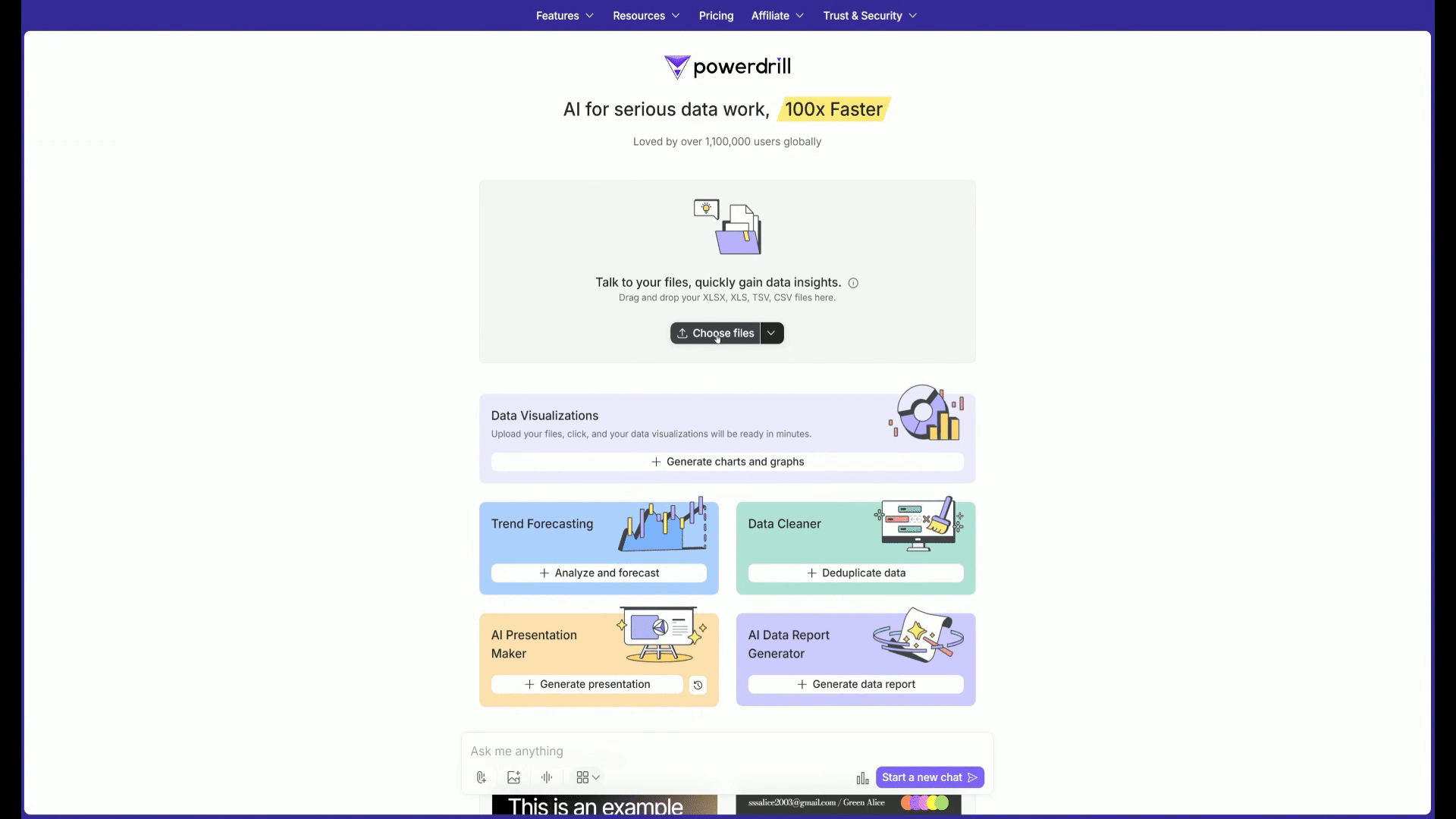
Step1: Upload Dataset
Start by uploading your dataset into Powerdrill. Upon entering the "New Chat" page, you will find five visualization widgets. Click on "Create Charts and Graphs" to upload your file. You don't need to clean the data, Powerdrill will handle it automatically. It supports various data file formats in Excel, including XLSX, XLS, TSV, and CSV.
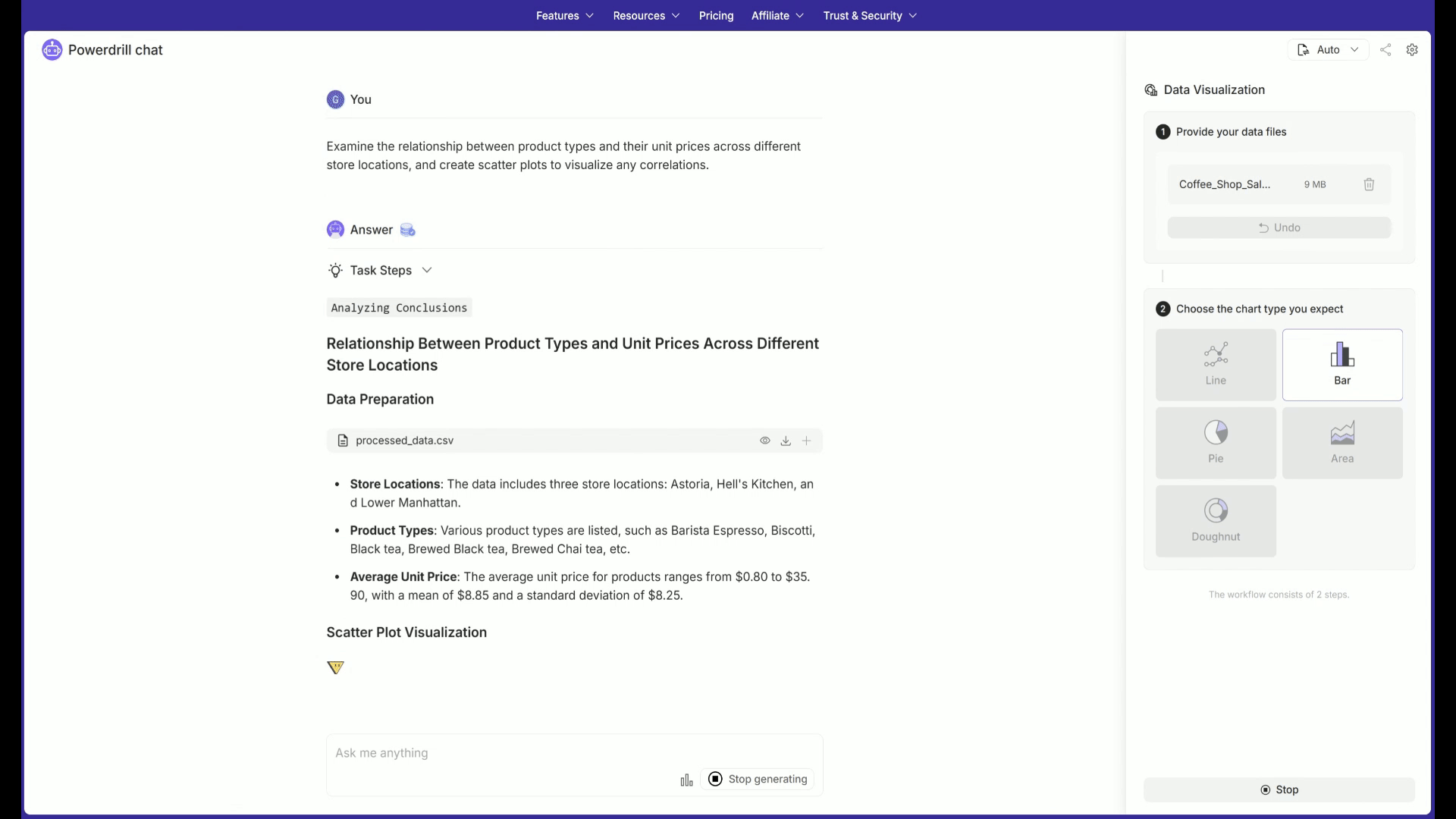
Step2: Select Visualization Type
Powerdrill offers a range of visualization options, including 5 basic types of graphs and common advanced graphs, including line chart, bar chart, pie chart, area chart, and doughnut chart. You could choose the type of visualization that best suits your data. Once you click the "Run" button, Powerdrill will proceed to analyze the data and generate visualizations.

Step3: Customize and Export
After generating visual charts in Powerdrill, you can interact with the charts. Powerdrill offers simple interactive features such as modifying colors, hiding variables, and changing the chart type. Additionally, Powerdrill supports adjustments to the charts through natural language interactions. You can easily export the charts as PNG format images.
After the chart is generated, you can change the type of chart again.

You can hide a specific category that is not needed by clicking on it.

You can choose your favorite color according to the style of the report.

You can interact with the chart and then convert it into an image.

Talk to Your File
More complex data visualizations can directly select to upload files and generate the charts you want through Q&A.
Step1: Upload Dataset
If the AI Agents for Data Analysis do not meet your needs, you can use natural language interaction to generate advanced visualization charts. On the "New Chat" page, simply select "choose files" to upload your data.
Step2: AI-Driven Analysis
Powerdrill's AI engine will automatically analyze the data and suggest the most relevant insights. You can click on the recommended questions automatically generated by Powerdrill and ask it to create data charts; alternatively, you can also formulate questions in natural language based on your needs, specifying the type of chart, and request Powerdrill to generate charts that meet your requirements.
Step3: Transform into presentation
When you are satisfied with the data visualization charts generated by Powerdrill, you can use our advanced 'Transform' feature to create a Presentation file containing these charts with just one click and then export it.

FAQ
What file formats does Powerdrill support?
Powerdrill supports Excel (XLS, XLSX), CSV, and TSV file formats.
Can I edit my charts after generating them?
Yes! Powerdrill offers interactive features to edit your charts, including changing colors, chart types, and hiding data points.
How do I integrate Powerdrill with Excel?
Powerdrill integrates seamlessly with Excel, allowing you to create visualizations directly from your dataset without needing any technical expertise.
Final Words
Integrating AI with Excel for data visualization offers a powerful combination of ease-of-use and advanced analytics. By automating the process of generating insights and creating visualizations, AI tools like Powerdrill enable businesses to make data-driven decisions more efficiently. No matter what type of data you analyze, AI-powered Powerdrill can transform raw data into actionable insights, driving better outcomes.


