
Introduction
Extracting text from Excel files is a common yet crucial task for many professionals. Whether you're analyzing data, preparing reports, or just organizing information, finding an efficient way to extract the text is essential. This process can often be time-consuming and complex, especially when dealing with large datasets. Fortunately, with Powerdrill AI, extracting text from Excel files has never been easier. In this guide, we’ll show you how to effortlessly extract text from your Excel files using Powerdrill AI.
Understanding Extracting Text from Excel
What is Extracting Text from Excel?
Extracting text from Excel refers to the process of pulling specific textual data from an Excel file and converting it into a usable format. Excel files often contain a combination of text, numbers, and formulas across multiple sheets and rows, which can be challenging to handle manually. With the right tools, however, this task can be simplified significantly.
Popular Text Extraction Tools
There are several tools available for extracting text from Excel files, including:
Microsoft Excel – Built-in text extraction features such as the "Find" tool can help, but they require manual effort.
Powerdrill AI – A fast, automated tool designed specifically for data analysis, including text extraction from Excel, which allows you to extract data in just a few clicks and analyze it instantly.
Step-by-Step Guide to Extracting Text from Excel with Powerdrill
Step 1: Uploading Your Excel File
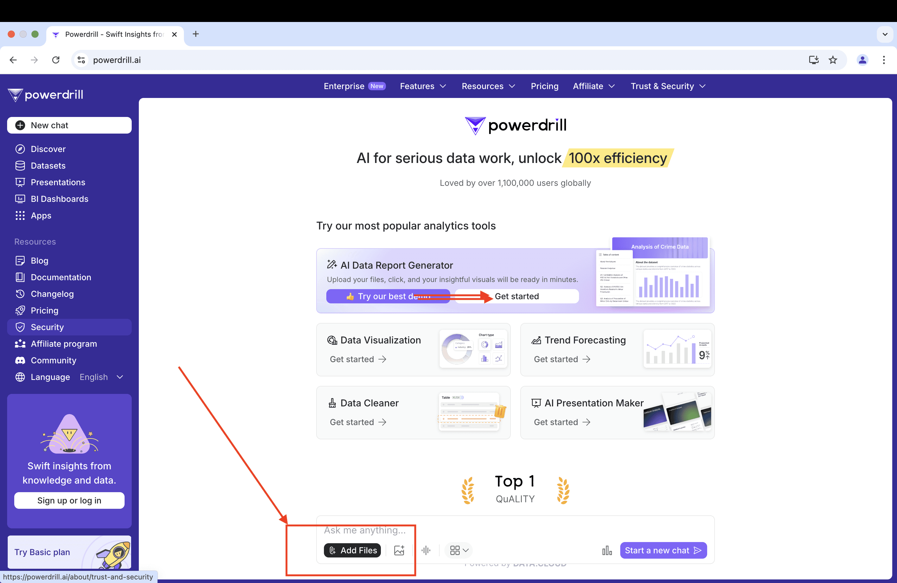
Click Add Files to upload the Excel file from which you want to extract text. Powerdrill is designed to handle various Excel formats, including .xls, .xlsx, and .csv, so you should be able to upload your file without any compatibility issues. You can upload up to 10 Excel/CSV/TSV files at a time.
Step 2: Providing text extraction requirements
By following a few straightforward steps, you can ensure that Powerdrill accurately extracts the data you need. Here's how to easily complete this step:
Determine the scope: Decide whether you want to extract text from the entire spreadsheet or just specific parts. You can choose specific columns, rows, or even individual cells.
Set filters: If the data volume is large, you can simplify the extraction process by setting filter conditions. For example, extract only cells containing specific keywords, dates, or numerical values.
Choose the format: Decide in which format you want the extracted text to be output. Powerdrill can export data as plain text, CSV, or JSON format, so choose the one that suits you best.
Step 3: Waiting for the extracting completes
Wait for about 10 seconds, then your data report is ready to take away. Once Powerdrill has completed the extraction, you will be notified that the process is finished. At this point, you can proceed to download the extracted data.
Also, you can upload your result again and click "generate data report" button to get a detailed report.
If you're interested in the report details, see the attachment below.
FAQ
Can I extract text from multiple Excel files at once?
Yes! Powerdrill allows you to upload and process up to 10 files at the same time, saving you time when working with multiple datasets.
What file formats does Powerdrill support?
Powerdrill supports Excel files in .xls, .xlsx, and .csv formats, ensuring compatibility with most spreadsheet types.
Is there a limit to the amount of data I can extract?
No, Powerdrill is designed to handle large datasets efficiently, allowing you to extract text from vast amounts of data without losing precision or speed.
Final Words
Extracting text from Excel doesn’t have to be a daunting task. With Powerdrill AI, you can streamline the process and ensure that all your data is extracted accurately and quickly. Whether you're handling small datasets or large, complex spreadsheets, Powerdrill’s user-friendly interface makes it simple to get the job done. Try it today and experience how efficient text extraction can be!
If you're interested in the report details, see the attachment below.
Analysis of Uber Reviews: User Feedback and Ratings
What is the distribution of review scores, and how does it vary across different app versions?
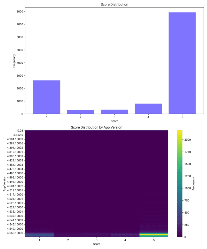
Overall Score Distribution
Score 5 Dominance: The most frequent score is 5, with a frequency of 7926.
Score 1 Frequency: The second most common score is 1, with a frequency of 2618.
Low Frequency Scores: Scores 2, 3, and 4 have significantly lower frequencies, with 317, 333, and 806 respectively.
Score Distribution by App Version
Varied Distribution: The distribution of scores varies significantly across different app versions.
Sample Data: For example, version 1.0.28 has a score of 5 with a frequency of 1, while version 1.41.10000 has scores ranging from 1 to 2 with varying frequencies.
Histogram and Heatmap
Histogram: The bar chart clearly shows the dominance of score 5, followed by score 1.
Heatmap: The heatmap illustrates the variation in score distribution across app versions, with higher frequencies of score 5 in recent versions.
Conclusion and Insights
High Positive Feedback: Overall, the app receives a high number of positive reviews, with score 5 being the most common.
Version Impact: Different app versions show varied score distributions, indicating that updates may affect user satisfaction differently.
How does the number of thumbs up correlate with the review scores given by users?
Correlation Coefficient
Correlation Coefficient: The correlation coefficient between the number of thumbs up and review scores is approximately -0.10. This indicates a very weak negative correlation, suggesting that there is little to no linear relationship between these two variables.
Visualization
Scatter Plot: The scatter plot visualizes the weak negative correlation, showing that the data points are widely scattered with no clear pattern or trend between thumbs up and review scores.
Conclusion and Insights
Weak Relationship: The analysis reveals a very weak negative correlation between the number of thumbs up and review scores, indicating that the number of thumbs up does not significantly influence the review scores.
Implications: This suggests that other factors might be more influential in determining review scores, and the number of thumbs up alone is not a strong predictor of user sentiment.
Are there any noticeable trends in the frequency of reviews over time?
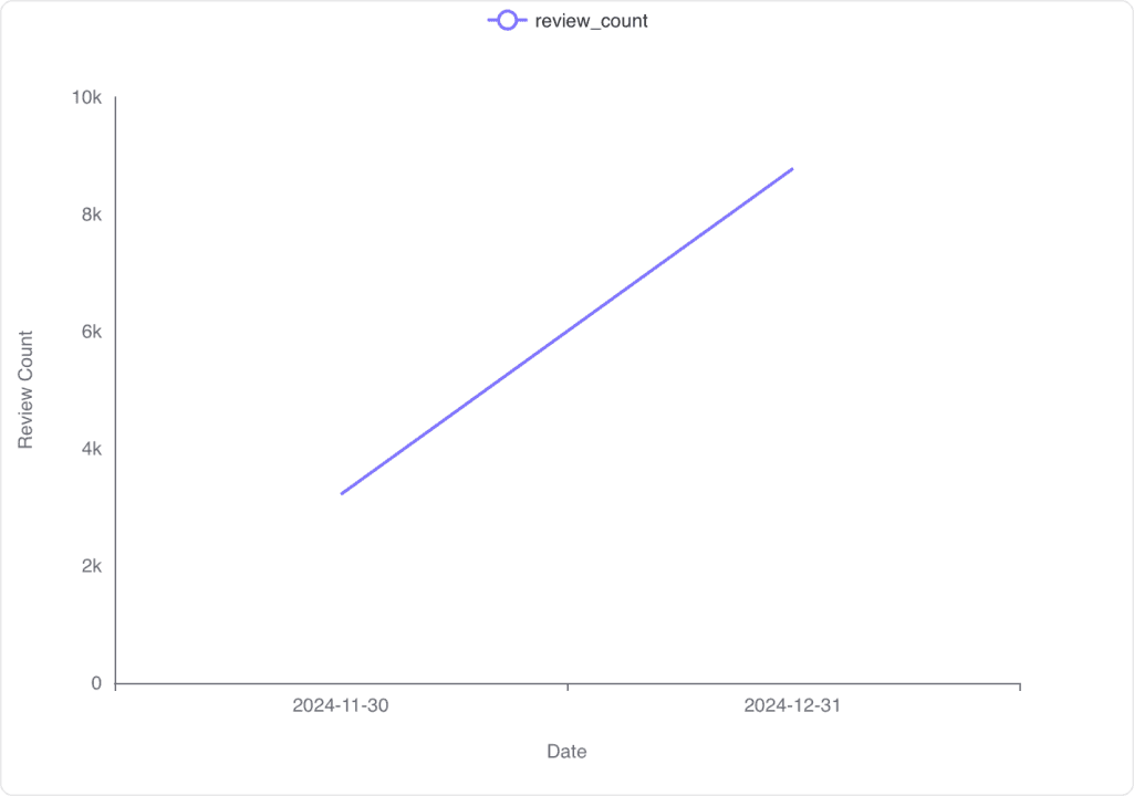
Monthly Review Count
November 2024: 3,218 reviews
December 2024: 8,782 reviews
Time Series Visualization
Trend: There is a noticeable increase in the number of reviews from November to December 2024.
Conclusion and Insights
Increasing Trend: The data shows a significant rise in review frequency from November to December 2024, indicating a possible seasonal or promotional influence.
Further Analysis: Additional data could help determine the cause of this increase, such as marketing campaigns or holiday effects.
Is there a correlation between the app version and the review score given by users?
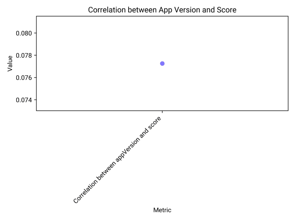
Correlation Coefficient
Correlation Value: The correlation coefficient between the app version and the review score is approximately 0.077. This indicates a very weak positive correlation.
Visualization
Scatter Plot Insight: The visualization shows a single point representing the correlation value, reinforcing the weak relationship between app version and review score.
Conclusion and Insights
Weak Correlation: The analysis reveals a very weak correlation between app version and review score, suggesting that changes in app version have little to no impact on user ratings.
Further Investigation: Additional factors may need to be considered to understand what influences user scores, as app version alone does not appear to be significant.
How does the content length of reviews vary with the score given?
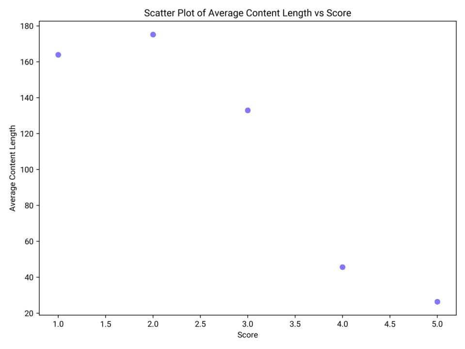
Analysis of Content Length by Score
Score 1: Reviews with a score of 1 have an average content length of approximately 163.89 characters.
Score 2: Reviews with a score of 2 have the longest average content length at about 175.19 characters.
Score 3: Reviews with a score of 3 have an average content length of around 132.98 characters.
Score 4: Reviews with a score of 4 show a significant drop in average content length to about 45.67 characters.
Score 5: Reviews with a score of 5 have the shortest average content length at approximately 26.36 characters.
Visualization of Content Length Variation
Scatter Plot: The scatter plot illustrates a clear trend where higher scores are associated with shorter average content lengths. Scores of 1 and 2 have the longest content, while scores of 4 and 5 have much shorter content.
Conclusion and Insights
Inverse Relationship: There is an inverse relationship between review scores and content length. Lower scores tend to have longer reviews, possibly indicating more detailed feedback or complaints.
Shorter Reviews for Higher Scores: Higher scores are associated with shorter reviews, which might suggest that satisfied customers provide concise positive feedback.
What percentage of reviews receive a reply, and does this vary with the review score?
Overall Percentage
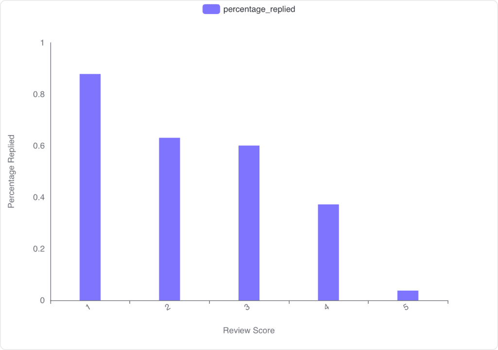
Overall percentage of reviews receiving replies: The data shows that the percentage of reviews receiving replies varies significantly with the review score.
Variation by Review Score
Score 1: 87.85% of reviews with a score of 1 receive a reply.
Score 2: 63.09% of reviews with a score of 2 receive a reply.
Score 3: 60.06% of reviews with a score of 3 receive a reply.
Score 4: 37.22% of reviews with a score of 4 receive a reply.
Score 5: Only 3.79% of reviews with a score of 5 receive a reply.
Visualization Insights
Bar Chart Analysis: The bar chart illustrates a clear trend where lower scores are more likely to receive replies, with the highest reply rate for score 1 and the lowest for score 5.
Conclusion and Insights
Higher likelihood of replies for lower scores: Reviews with lower scores are more likely to receive replies, indicating a focus on addressing negative feedback.
Significant drop for high scores: There is a notable decrease in reply rates for higher scores, suggesting less engagement with positive feedback.
Analyze the sentiment of the review content for high-scoring versus low-scoring reviews and identify any patterns or differences in sentiment expression.
Sentiment Comparison Data
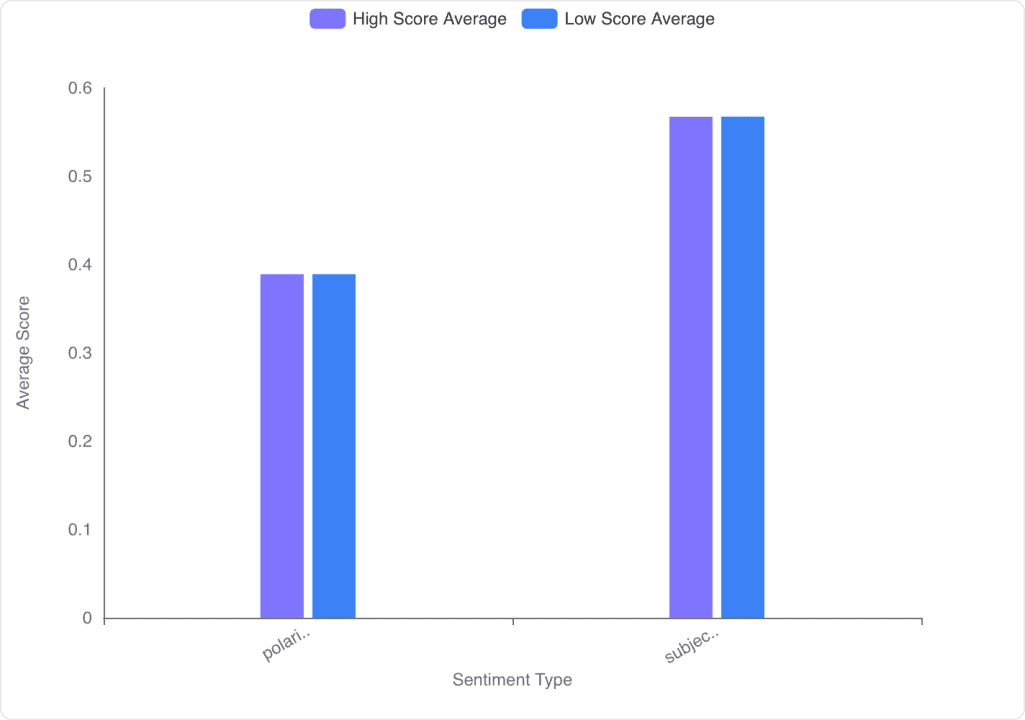
Polarity: Both high-scoring and low-scoring reviews have the same average polarity of 0.39. This indicates that the sentiment expressed in both types of reviews is similarly positive or negative.
Subjectivity: The average subjectivity for both high-scoring and low-scoring reviews is 0.57, suggesting that reviews are equally subjective, reflecting personal opinions and feelings.
Visualization of Sentiment Analysis
Bar Chart Representation: The bar chart shows no significant difference in the average scores for polarity and subjectivity between high-scoring and low-scoring reviews. Both categories have identical scores, indicating a lack of variation in sentiment expression.
Conclusion and Insights
Lack of Variation: There is no noticeable difference in sentiment polarity and subjectivity between high-scoring and low-scoring reviews. This suggests that the sentiment expression is consistent across different review scores.
Potential Implications: The similarity in sentiment might imply that factors other than sentiment, such as specific content or context, could be influencing the review scores. Further analysis might be needed to explore these aspects.


