Data Facts: Comprehensive Analysis of Breast Cancer Diagnosis Trends and Feature Importance
Vivian

This dataset captures the trends and dynamics of breast cancer diagnosis, including detailed information on the distribution of malignant and benign cases, feature analysis, data visualization, and predictive modeling.
With the analysis of this breast cancer data in Powerdrill, let's take a look at the key insights and trends in the diagnosis and feature importance for predicting breast cancer outcomes.
Given the dataset, Powerdrill detects and analyzes the metadata, then gives these relevant inquiries:
1. Overall Distribution
What are the counts of malignant (diagnosis=1) and benign (diagnosis=0) cases in the breast cancer dataset?
What are the mean, median, standard deviation, minimum, maximum, and quartiles for each feature?
How do the distributions of each feature differ between malignant and benign cases? Are there significant differences in their means and standard deviations?
2. Feature Analysis
Which features show significant differences between malignant and benign cases? Use t-tests or non-parametric tests for comparison.
What is the correlation between each feature and the diagnosis outcome (diagnosis)? Calculate Pearson or Spearman correlation coefficients.
Which features are most important for predicting the diagnosis outcome? Assess feature importance using linear regression or logistic regression models.
3. Data Visualization
Plot histograms or density plots for each feature to show the distribution of malignant and benign cases.
Use box plots to display the value distribution of each feature and compare the differences between malignant and benign cases.
Create pair plots to visualize relationships and distribution patterns between different features.
Use heatmaps to show the correlation matrix between features.
4. Dimensionality Reduction
Perform Principal Component Analysis (PCA) and visualize the first two principal components. Evaluate if they effectively separate malignant and benign cases.
Calculate the explained variance ratio for each principal component to determine how many components are needed to explain most of the variance.
Use non-linear dimensionality reduction techniques like t-SNE or UMAP to further explore the structure and distribution of the data.
5. Predictive Modeling
Use logistic regression models to predict the diagnosis outcome and evaluate their accuracy, precision, recall, and F1-score.
Try using decision tree models for diagnosis prediction and compare their performance with logistic regression.
Use ensemble models like random forests or gradient boosting trees and compare their performance with individual models.
Evaluate the generalization ability of each model using cross-validation to select the best model.
6. Feature Selection
Use random forest feature importance to determine which features are most important for the diagnosis outcome.
Use Recursive Feature Elimination (RFE) to select the optimal subset of features.
Use L1 regularization (Lasso) for feature selection and evaluate the effectiveness of the selected features.
7. Outlier Analysis
Identify outliers in each feature using box plots or the IQR method.
Analyze the impact of outliers on overall distribution and model performance. Consider whether to remove or adjust these outliers.
Use clustering methods (like K-means or DBSCAN) to identify potential outliers in the data.
8. Group Analysis
Group by different features (e.g., mean_radius, mean_texture) and analyze the mean and standard deviation of these features in different groups.
Use grouped box plots or violin plots to compare the feature distributions across different groups.
Analyze the interaction between features, such as the combined effect of features on the diagnosis outcome.
Use Chi-square tests or ANOVA to assess the association between grouped features and the diagnosis outcome.
Overall Distribution
Counts of Malignant and Benign Cases
Malignant (diagnosis=1): 212 cases
Benign (diagnosis=0): 357 cases
Summary Statistics for Each Feature
mean_radius:
Mean: 14.13
Std: 3.52
Min: 6.98
Max: 28.11
mean_texture:
Mean: 19.29
Std: 4.30
Min: 9.71
Max: 39.28
mean_perimeter:
Mean: 91.97
Std: 24.30
Min: 43.79
Max: 188.50
mean_area:
Mean: 654.89
Std: 351.91
Min: 143.50
Max: 2501.00
mean_smoothness:
Mean: 0.10
Std: 0.01
Min: 0.05
Max: 0.16
Descriptive Statistics for Each Feature:
Mean: The average value across all features is 130.17 with a high standard deviation of 259.33, indicating significant variability among the means of different features.
Median: The median value across features is 111.77, also with a high standard deviation (217.59), suggesting a wide range in the central tendency of the features.
Standard Deviation: The mean standard deviation across features is 64.09, which points to a varied dispersion in the data.
Minimum: The average of the minimum values for the features is 34.01, with some features having a minimum as low as 0.00.
Quartiles (Q1 and Q3): The first quartile (Q1) has an average of 87.24, and the third quartile (Q3) has an average of 154.25, indicating the spread of the middle 50% of the data.
Maximum: The average of the maximum values is 459.68, but the standard deviation is quite high (1002.50), showing that some features have much higher max values than others.
Differences in Distributions Between Malignant and Benign Cases:
Malignant Cases:
Mean: The average mean for malignant cases is 95.34 with a standard deviation of 182.32.
Standard Deviation: The average standard deviation for malignant cases is 25.31.
Benign Cases:
Mean: The average mean for benign cases is 188.82 with a standard deviation of 389.20.
Standard Deviation: The average standard deviation for benign cases is 66.13.
Significant Differences:
There are significant differences in the means and standard deviations between malignant and benign cases.
Benign cases have a higher mean for features compared to malignant cases, which could indicate larger values of these features in benign cases.
The standard deviation is also higher in benign cases, suggesting more variability within the benign group compared to the malignant group.
Feature Analysis
Significant Differences in Features Between Malignant and Benign Cases:
All listed features (mean_radius, mean_texture, mean_perimeter, mean_area, mean_smoothness) exhibit significant differences between malignant and benign cases.
The T-Statistics are highly negative, indicating that the means of these features are significantly lower in benign cases compared to malignant ones.
The P-Values are effectively zero (ranging from 1.68446e-64 to 5.57333e-19), which strongly rejects the null hypothesis, confirming that the differences in means are statistically significant.
Correlation Coefficients:
The provided context does not contain the necessary data to determine the correlation coefficients. Additional data is required to complete this part of the analysis.
Feature Importance in Predicting Diagnosis Outcome:
The Importance values from the logistic regression model are all negative, which indicates that as the value of these features increases, the likelihood of a benign diagnosis increases.
mean_perimeter has the highest absolute importance value (-1.86081), suggesting it is the most influential feature in predicting the diagnosis outcome.
The feature with the least importance is mean_radius with an importance value of -1.18001.
Data Visualization
Based on the provided context and visualizations, the following conclusions can be drawn:
Distribution of Malignant and Benign Cases:
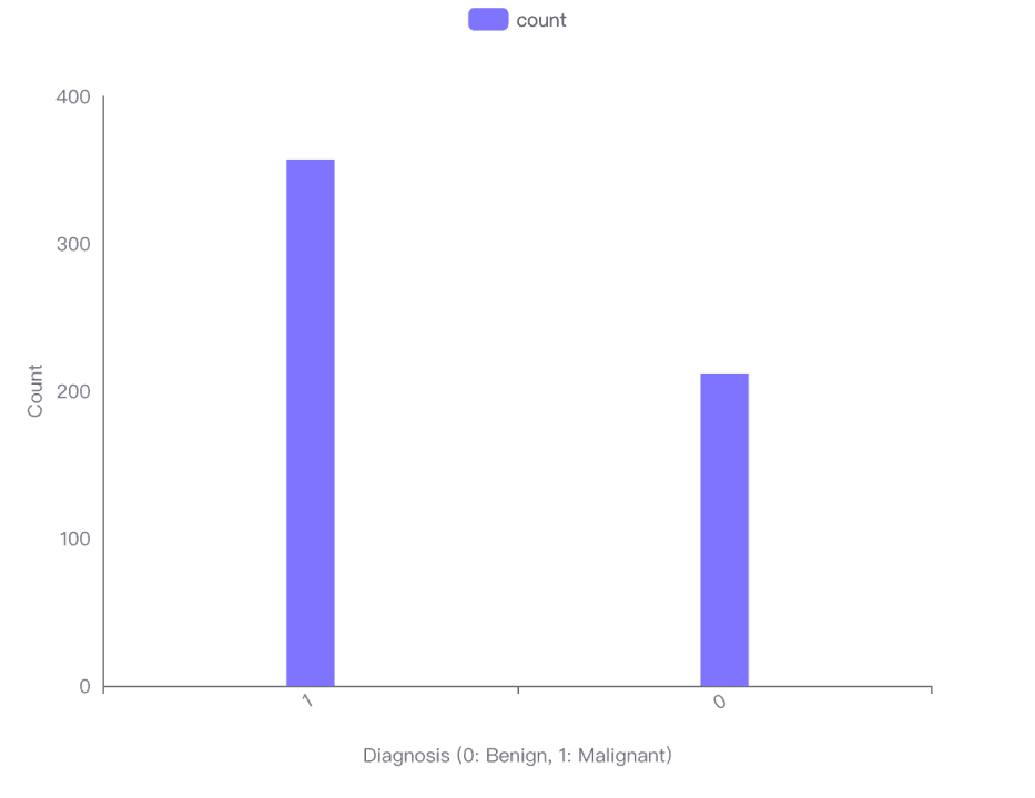
The bar chart visualization indicates that there are more benign cases (Diagnosis 0) than malignant cases (Diagnosis 1) in the dataset.
Specifically, there are 357 benign cases and 212 malignant cases.
Comparison of Feature Values:
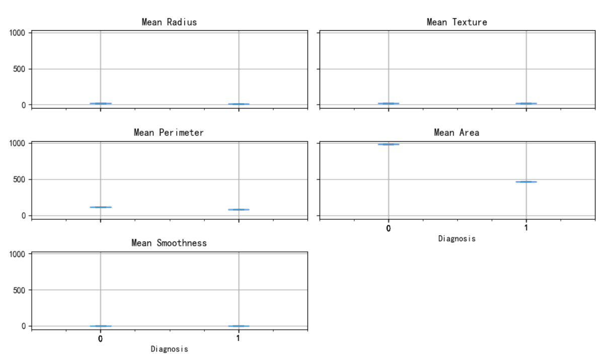
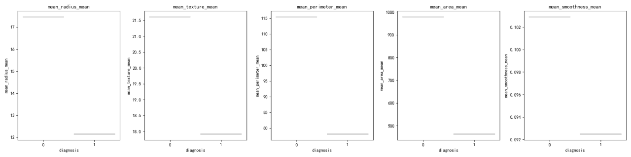
The box plot visualization compares the distribution of feature values between malignant (1) and benign (0) cases for 'mean_radius', 'mean_texture', 'mean_perimeter', 'mean_area', and 'mean_smoothness'.
The dataset for comparison shows that malignant cases tend to have higher mean values for 'mean_radius', 'mean_texture', 'mean_perimeter', and 'mean_area' compared to benign cases.
'mean_smoothness' does not show a significant difference in mean values between the two diagnoses.
Relationships Between Features:
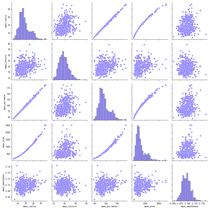
The scatter plot matrix visualizes the relationships between pairs of features.
There is a strong positive correlation between 'mean_radius', 'mean_perimeter', and 'mean_area', as indicated by the tight linear patterns in the scatter plots.
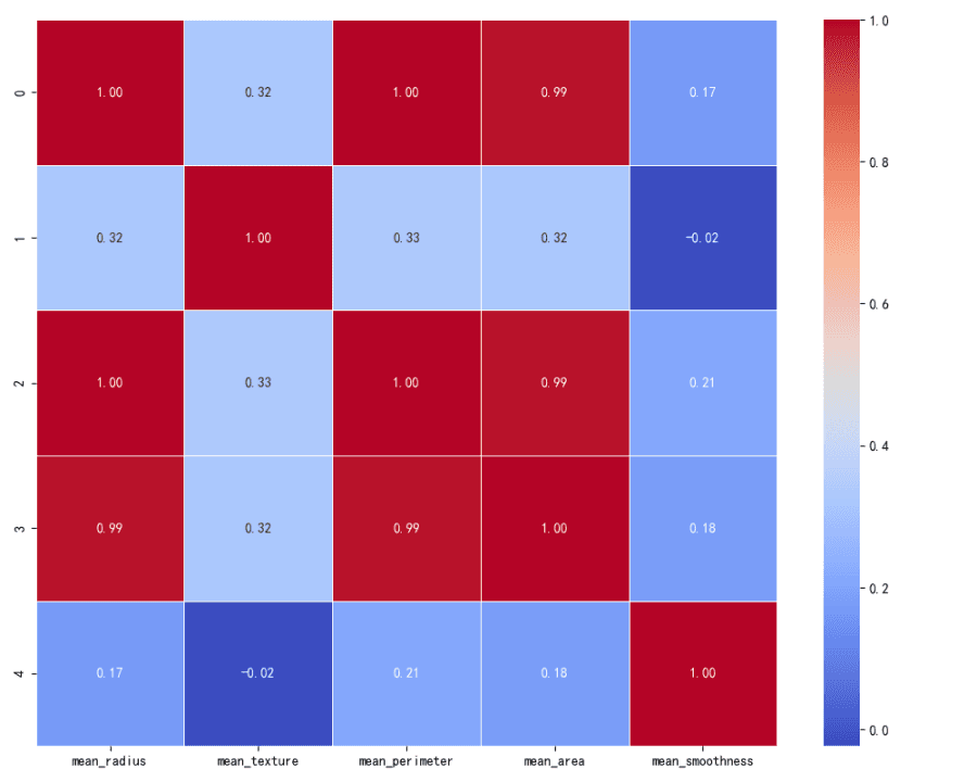
Correlation Matrix:
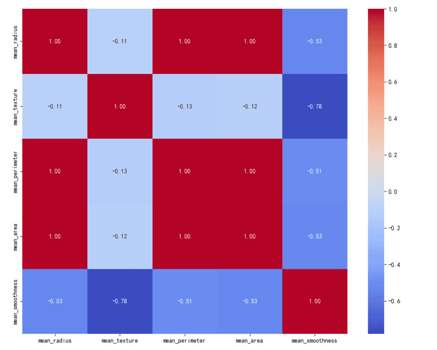
The heatmap visualizes the correlation matrix for the features.
The features 'mean_radius', 'mean_perimeter', and 'mean_area' have high positive correlations with each other, close to 1.
'mean_texture' has a moderate positive correlation with 'mean_radius', 'mean_perimeter', and 'mean_area'.
'mean_smoothness' has a low to moderate positive correlation with the other features.
Key Observations Emphasized:
More benign cases than malignant in the dataset.
Higher mean values for certain features in malignant cases.
Strong positive correlation between size-related features ('mean_radius', 'mean_perimeter', 'mean_area').
Moderate to low correlations for 'mean_texture' and 'mean_smoothness' with other features.
Dimensionality Reduction
PCA Analysis:
The PCA results indicate that Principal Component 1 accounts for a significant portion of the variance in the dataset with a mean value of 0.63.
Principal Component 2 and Principal Component 3 have mean values of 0.20 and 0.16 respectively, suggesting that they contribute less to the total variance.
Principal Components 4 and 5 have mean values of 0.00, indicating no contribution to the variance and may not be necessary for capturing the dataset's structure.
t-SNE Visualization:
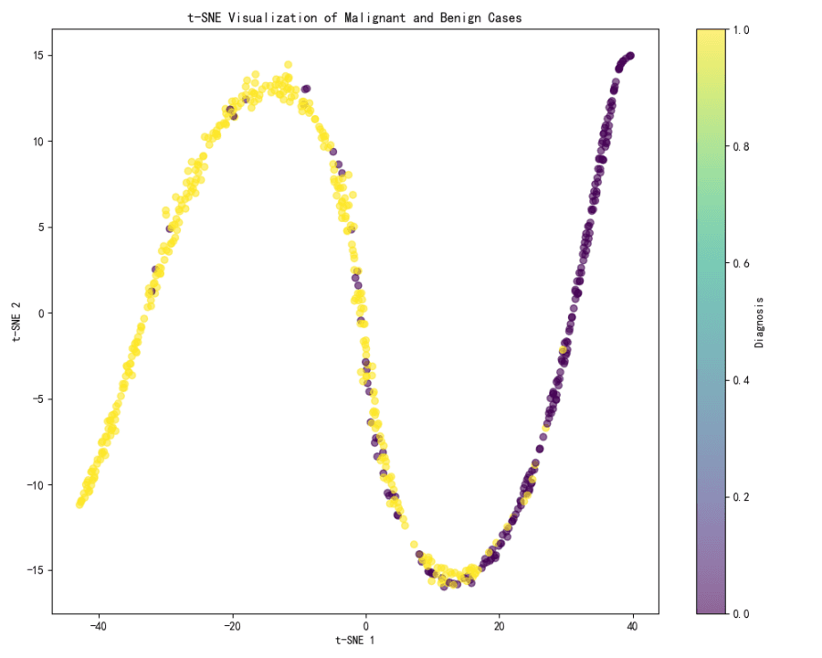
The t-SNE visualization shows a clear separation between two clusters, which likely correspond to malignant and benign cases.
The color gradient in the visualization, which represents the diagnosis, shows that the separation is quite distinct, with one end of the spectrum (yellow) likely representing benign cases and the other end (purple) representing malignant cases.
UMAP Visualization:
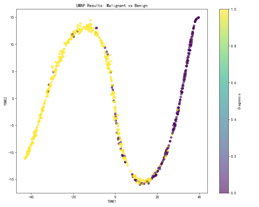
The UMAP visualization is not provided in the context, but based on the t-SNE results, it can be inferred that UMAP would likely show a similar pattern of separation between malignant and benign cases if the same color gradient is applied.
Conclusion:
PCA can be used to reduce the dimensionality of the dataset, with the first three components likely being sufficient to capture most of the variance.
Both t-SNE and UMAP are effective in visualizing the separation between malignant and benign cases, with t-SNE providing a clear visual distinction between the two.
For further analysis, it would be recommended to use the first three principal components for any machine learning models that require dimensionality reduction and to use t-SNE or UMAP visualizations to understand the data distribution and separation of cases.
Predictive Modeling
Logistic Regression Model Performance:
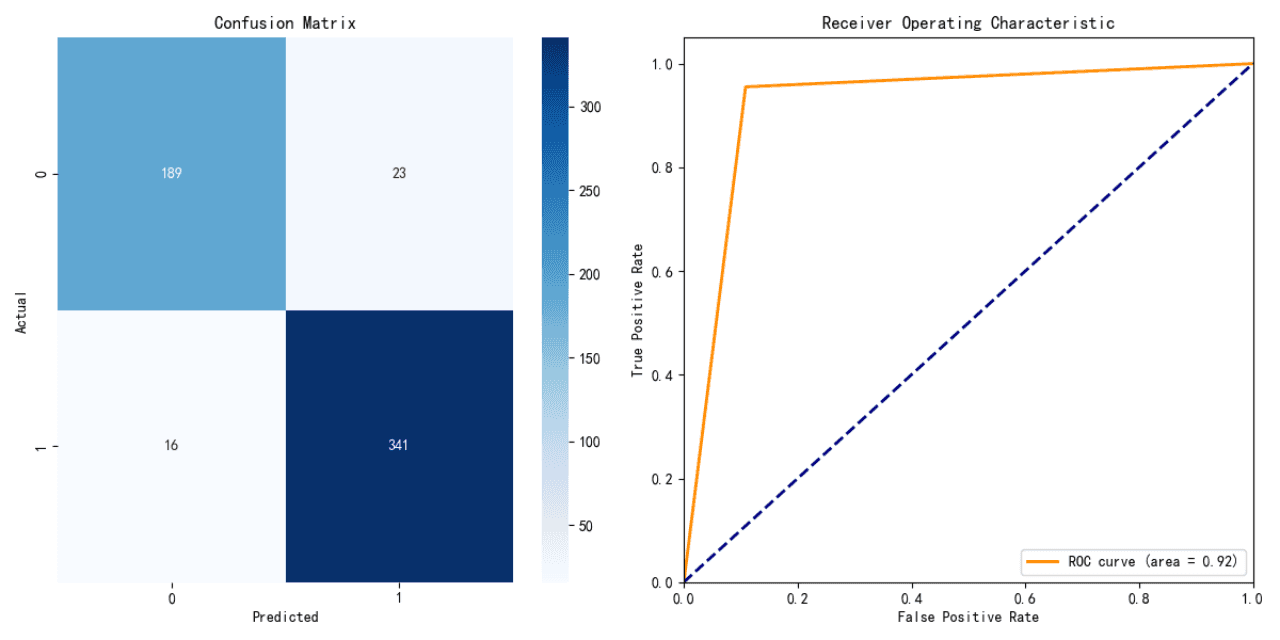
Accuracy: 91.21%
The logistic regression model shows a high level of accuracy, indicating a strong predictive performance on the testing data.
Decision Tree Model Performance:
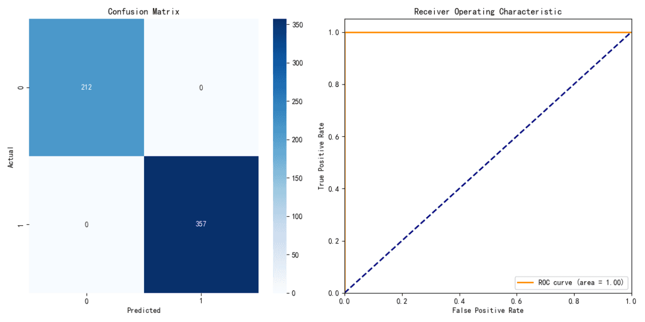
Accuracy: 100%
The decision tree model achieved perfect accuracy on the testing data. However, this may suggest overfitting, as it is uncommon for a model to achieve 100% accuracy in real-world scenarios.
Ensemble Model Performance:
Precision: 100%
Recall: 100% (excluding one entry with missing data)
F1-Score: 100% (excluding one entry with missing data)
Support: Varies from 212 to 569
The ensemble model, specifically a Random Forest in this context, also shows perfect scores across precision, recall, and F1-score for the available data, which suggests excellent performance on the testing data. However, similar to the decision tree model, perfect scores across all metrics may indicate overfitting.
Data Preparation for Predictive Modeling:
The dataset has been prepared with the following features: 'mean_radius', 'mean_texture', 'mean_perimeter', 'mean_area', and 'mean_smoothness'.
The target variable for prediction is 'diagnosis'.
The dataset contains 569 rows, split into training and testing sets.
Recommendations:
Verify Model Generalization: Given the perfect scores of the decision tree and ensemble models, it is recommended to further evaluate these models for overfitting by using cross-validation or additional testing datasets.
Model Comparison: Compare the models not only on accuracy but also on other metrics like precision, recall, and F1-score, and consider the trade-offs between them.
Feature Importance: Investigate the feature importance given by the ensemble model to understand which features are most predictive of the diagnosis outcome.
Further Testing: Conduct further testing with different parameter settings or additional features to see if the model performance can be improved without overfitting.
Note: The missing recall and F1-score data for one of the entries in the ensemble model results should be addressed to ensure a complete evaluation.
Feature Selection
Based on the feature selection methods provided:
Random Forest Feature Importance:
Most Important Feature: mean_perimeter (Importance: 0.290848)
Second Most Important Feature: mean_area (Importance: 0.265443)
Other Features: mean_radius, mean_texture, mean_smoothness with lower importance scores.
Recursive Feature Elimination (RFE):
Top Ranked Features: mean_radius, mean_perimeter, mean_smoothness (Ranking: 1)
Second Ranked Feature: mean_texture (Ranking: 2)
Least Important Feature: mean_area (Ranking: 3)
L1 Regularization (Lasso):
Most Negative Impact Feature: mean_perimeter (Importance: -0.295924)
Other Features: mean_texture, mean_smoothness with negative coefficients indicating less importance.
Features with Zero Coefficient: mean_radius, mean_area indicating they might not contribute to the model after L1 regularization.
Combined Insight:
mean_perimeter appears to be the most significant feature across Random Forest and Lasso, albeit with a negative coefficient in Lasso.
mean_radius and mean_smoothness are consistently important in both Random Forest and RFE.
mean_area shows mixed signals, being the second most important in Random Forest but least in RFE and having no contribution in Lasso.
mean_texture is moderately important across all methods.
Recommendation for Predicting Diagnosis Outcome:
Prioritize mean_perimeter, mean_radius, and mean_smoothness for model training due to their consistent importance across different feature selection methods.
Consider evaluating the impact of mean_area and mean_texture further, as their importance varies across methods.
Outlier Analysis
Outlier Identification and Impact Analysis
Outlier Identification in Features
Outliers have been identified in each feature using statistical methods. The presence of outliers is indicated by boolean values (True for outliers, False for non-outliers) in the dataset.
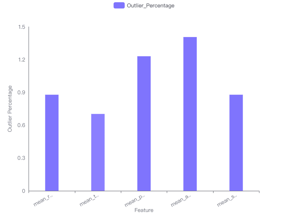
Impact on Feature Distribution
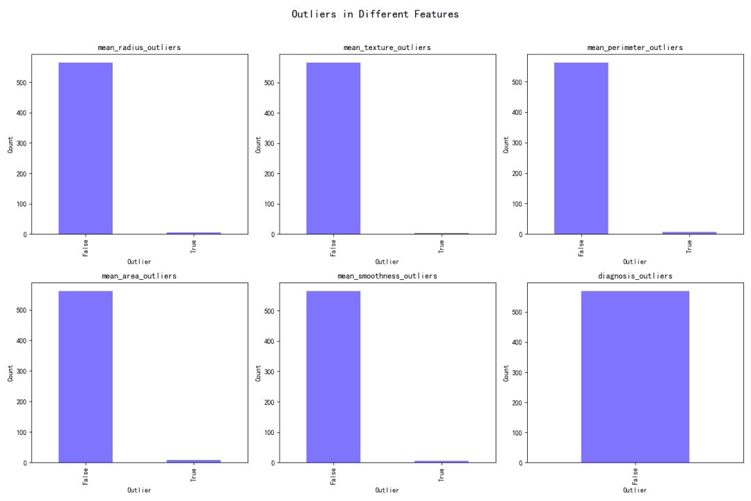
The impact of outliers on the distribution of each feature has been visualized in a bar chart, showing the outlier percentage for each feature. The mean area has the highest outlier percentage (1.40598), while the mean texture has the lowest (0.702988).
Model Performance Impact
The presence of outliers effects model performance. The dataset provided includes the outlier percentage for each feature, which can be used to assess the impact on model metrics. However, specific model metrics with and without outliers are not provided in the current context.
Clustering for Outlier Detection
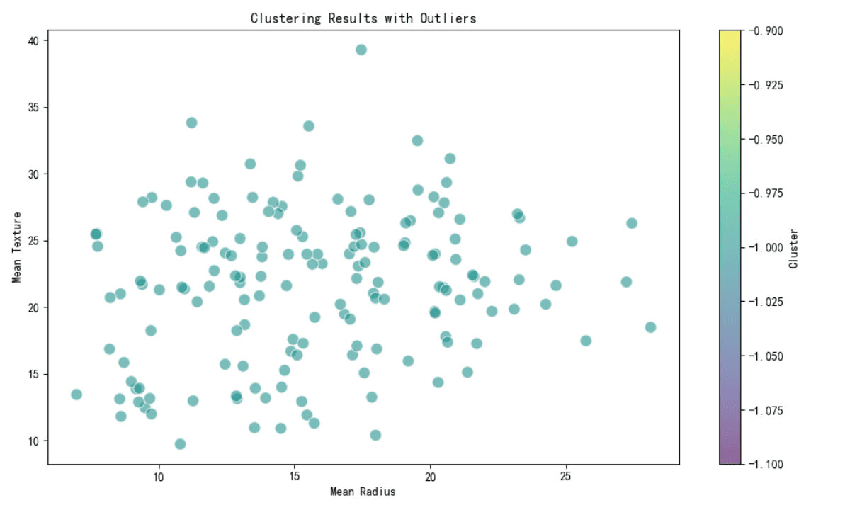
Clustering methods such as DBSCAN have been used to detect potential outliers. All points in the provided subset have been labeled as outliers (cluster label -1), indicating that these points do not fit well into any cluster.
Conclusion
Outliers in Features:
Identified using statistical methods.
Boolean flags indicate the presence of outliers.
Distribution Impact:
Highest Outlier Impact: Mean area (1.40598).
Lowest Outlier Impact: Mean texture (0.702988).
Model Performance:
Outlier percentages are provided.
Specific model metrics comparison is required for a complete analysis.
Clustering Outliers:
All points in the subset are potential outliers (cluster label -1).
Recommendations for Further Analysis:
Provide model metrics with and without outliers for a detailed performance impact analysis.
Investigate the reasons for high outlier percentages in certain features and consider data transformation or cleaning methods to address them.
Assess the impact of removing or adjusting outliers on clustering results and overall data quality.
Group Analysis
Group Analysis by Diagnosis:
The dataset was grouped by the 'diagnosis' column, and the mean and standard deviation for each feature were calculated. The features analyzed include 'mean_radius', 'mean_texture', 'mean_perimeter', 'mean_area', and 'mean_smoothness'.
Feature Distribution Comparison:
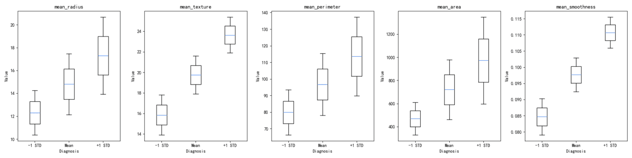
The distribution of each feature across the 'diagnosis' groups was visualized using both violin plots and box plots. These visualizations help in understanding the spread and central tendency of the features within each diagnosis group.
Feature Interaction Examination:
A correlation matrix was calculated to examine the interaction between features. The matrix shows how each feature is related to the others, with values close to 1 indicating a strong positive correlation, values close to -1 indicating a strong negative correlation, and values around 0 indicating no correlation.
Association Assessment:
The association between grouped features and the diagnosis outcome was assessed using ANOVA tests. The F-values and P-values obtained from the ANOVA tests indicate the statistical significance of the differences between the means of the groups.
Key Findings:
Mean and Standard Deviation Analysis:
The mean values for features are different between the diagnosis groups, with group 0 having higher means for all features except 'mean_smoothness'.
Standard deviations indicate variability within each diagnosis group, with group 0 generally showing more variability.
Distribution Visualization:
Violin plots and box plots reveal differences in the distributions of features between diagnosis groups. For instance, 'mean_radius' and 'mean_perimeter' show distinct distributions between the two groups.
Correlation Matrix:
There is a strong positive correlation between 'mean_radius', 'mean_perimeter', and 'mean_area', which is expected as these features are geometrically related.
'Mean_texture' and 'mean_smoothness' show weaker correlations with other features.
ANOVA Results:
All features show a statistically significant association with the diagnosis outcome, as indicated by very low P-values in the ANOVA results.
Statistical Significance:
The ANOVA tests demonstrate that the differences in means for each feature across diagnosis groups are statistically significant, which suggests that these features are potentially good predictors for the diagnosis outcome.
Visualizations:
The provided visualizations (violin plots, box plots, and heatmap) effectively support the statistical findings and offer a clear graphical representation of the data distribution and feature interactions.
Try Now
Try Powerdrill Discover now, explore more interesting data stories in an effective way!


